There’s something that I noticed, that is super easy to do, everyone can do it with a free Canva account. What I noticed is that many collections either do not have a collection cover at all, and some have collage photo ones, and the two are so incredibly noticeable and what a big difference it makes. It’s like the collection cover image is “just another thing to get to”, but that is the importance of it. Once you realize that someone like me, who is ambitious enough to go find your collections to promote them…which one do you think I’ll choose? I’m not harping on anyone about it, because I realize that I’ve been in the boat of never been able to get back to this detail. Yet here we are, and we’ll complain our sales being down.
I think it’s time to face the fact that AI is helping Z a whole lot. The only thing I see that we can do is to increase promoting, but concentrate on what Z has said in the past. Promote our collections. You don’t have to, all I’m saying is that maybe that’s where we may pick up referrals and help our sales. And since the cover images could show a collages of what’s inside your collection; they may just be the easiest way to promote. For instance, even if you take your top products and go to Canva and make a quad photo collage for your collection, it may be better than nothing. It’s free to use their frames. You can size your collection cover image between 1480x1480px up to 2048x2048px, and then copy/paste it over into a 1000x1000px png for a Pinterest pin.
One note about this is that I don’t think Zazzle overtakes collection pins, that I’ve noticed. And this important, because our collections are not a specific product that they can overtake it with.
I personally think that the collage photos that some folks use on their collections are hurting their sales—not helping them. Collage-style cover photos are visually cluttered, hard to see at thumbnail size, and prevent viewers from clicking on those collections. Humans are lazy by nature and tend to walk away from visual overstimulation that looks like a lot of work to decipher. They will give 1-2 seconds of their time to a thumbnail when they are scrolling and shopping. When they see overly cluttered photos, they just keep on scrolling. One simple, streamlined, elegant cover photo that showcases one of the products in a collection (and without distracting background items) is all that’s needed to stop the scroll. If all you get is 1-2 seconds of their time, show potential customers one example of your best work in a collection. Even a collage of four products is overkill. When it comes to design, keep in mind that less is more.
I agree that cover photos are too busy and distracting. There is one on-page collection layout that has a huge photo, plus several smaller ones to the right. Zazzlers are now putting these huge call to actions in the center and then really busy graphics all over the place. It is hard to focus on the products.
I’m going to have to disagree with you both, as far as marketing and promoting goes today. There are ways to not be too cluttered, and still create nice looking collages. In fact, some have featured photos on the main product, with the add-ons that are not that small.
Less is not more, if they only see one product and assume it’s lonely and boring. Then, they’re surely going to scroll by in seconds. I think I would unless is stunning and something I’m profoundly interested in. Also take into account that you may think it’s the best representation, but what if your customer isn’t on that same vibe with you?
The marketing and promotion place is supposed to be distracting and eye-catching. Problem solved, I think, of stopping them to consider, maybe read it, and to understand what you’re offering them.
Also, my point is that out of sharing and promoting a collection, one focused, cover-imaged, product is not a collection anymore. It becomes only one product choice for the customer.
I’ve done collage collection covers and I’ve also done the promo lifestyle covers, and honestly I’ve noticed the promo ones with the gold embossed font seem to get more views for me, they just grab the viewer’s attention right away. When I share on Pinterest, the promo-style cover gives the viewer a little more info than a plain mockup with no text, and the collage ones can actually hurt rather than help because sometimes people assume the whole wedding ensemble shown in the image is what they’re buying, which can feel like false advertisement. So for me, keeping it simple but still eye-catching works better, and when I say promo I mean tasteful… not the “shop my store” or “click here” stuff, that kind of promo looks kinda desperate, better to do magazine-quality promo images for collection covers, in my opinon. I updated this collection cover a couple weeks ago and it it is getting views, Especially at pinterest.
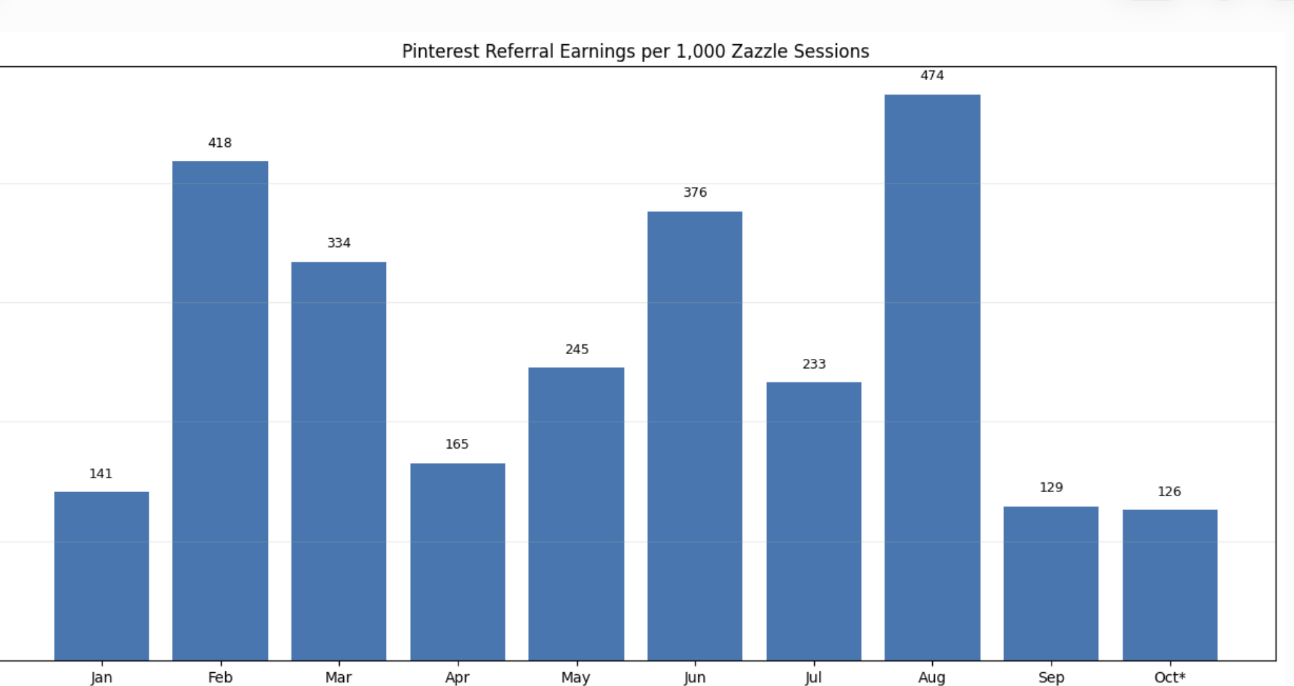
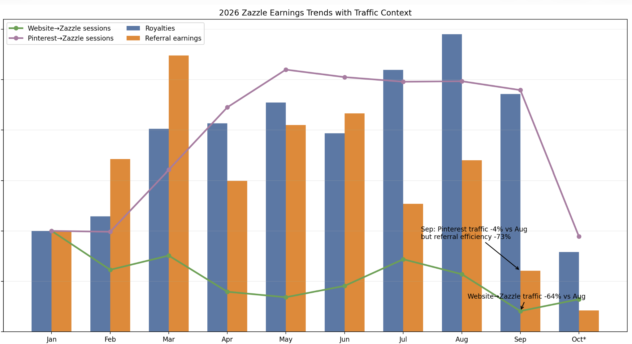
You might be onto something with the collection sharing vs product sharing on Pinterest now. I just analyzed a bunch of data here. I have my website referrals set up with a tracking id, so I know which referrals come from pinterest and which ones from my website. My Pinterest referral efficiency (where I mostly have single products shared) was down 64% September compared to August. I wonder if collection sharing would do better. But I suspect the reason might be the “swap design” template thing in the editor. I’m not sure if my royalties went up because of that swap design thing or not, but referrals was the thing that made Zazzle a better option for me than going alone on my own website. There is seasonality in here too, and I have no idea why it made January all the same.
For me, royalties alone aren’t going to make it unless I really make a ton of products. I’m just worried that my time might be better spent building my website back out and using printing partners. A lot to think about, for sure.
One thing I definitely see, though. Pinterest traffic efficiency was way down September. I think they added the templates to the design tool in August sometime.
Edit: All of this analyzing is making me think that I should not have gotten my hopes up about self referrals. Not when Zazzle controls where the traffic goes coming in. Pinning collections makes sense, though.
*For anyone who looks at this in the future. We’re only halfway through October right now, so the dip looks worse than it is (I hope).
I agree. I have some older collections that only have one product as the collection photo, and I need to back and fix it. I think it might be a sign. It looks random when someone clicks on an invite and sees a sign as the next photo. I can see how that would be confusing/look sloppy.
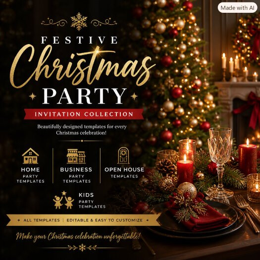
See, I actually love this look with the gold and white text layout. I’m engaged with my eyes first, reading the big print. But it looks detailed, I’ll come back to this one (you put so much effort into it, that I want to understand it)…BUT, the photo of a Christmas tree, a candle lit, and a wine glass, does confuse me, and then I read “Invitation Collection” -but not seeing an invitation, well, that’s perhaps when a potential customer may start to drift away at this point.
My mind says, Yes! Go for the text, but add something to stimulate my eyes further to tempt me and tell me what’s there as my ‘why’ example, ya know? I honestly can say, I lack this beautiful talent of arrangement of the look here. But adding an example of an invitation, I think, tells me to click on over without any text to “click to view, etc.”.
What I think is important is a “sampling promo lifestyle” type of cover, and I’ll disagree about people assuming the whole collection is shown. I think people are more like ourselves, inquisitive by nature, want the invitation to look further, but not told to or given no choice but to click thru to see the collection. However, this could be in the psychology of different personality traits. Some are introverts and think like me about subtle hints. Others are extroverts and want simplicity or this promo style. Perhaps it’s a bit of both techniques, alternating between them. So visually, you have two types of choices for everyone.
In my seeing what Zazzle’s AI has in store for us, there’s very little question in my mind that product promotion is gone by the wayside. Every attempt seems to come back to that template swap deal, or some new way to deflect and look over here on Zazzle’s part so they’re getting all referrals. So much so, that I feel okay about putting my referral codes on my product promotions now. Not a good feeling, but just okay about it.
This is why I started thinking about regularly sharing collections. Zazzle told us to, and I think they’re working on other ways to bring customers in. Leaving us to figure out what draws customers to view a collection, and what peaks their interests. I’m trying out multiple things to see what’s working. But, I will say my click throughs are stronger compared to before on single products. So, that’s where my audience is engaging more. Plus, I’ve looked back at multiple designer’s and have noticed that I was missing something important. It’s about having covers that include a “mood board” style. Does anyone remember Polyvore? That’s some part of the kind of style I’m encouraged by, that I want to create, and seek to promote now. It’s being done now on Canva, I think, but I have yet to get better at mine. I don’t think it needs, all the time, a lot of text. Some looks good to grab attention, sometimes a hint or suggestion, and bouncing back and forth is probably in the right area.
That’s not a bad idea, re referral codes on links for the 15% instead of gambling on the 35-50% and that the customers we bring in will stay on our products with that new template swap thing! I’d be willing to try that out with the links coming from my website. 15% isn’t a horrible profit margin, depending on the sale.
Edit: and actually, a better chance at 15% on like 3 sales is better than 50% on 0 sales. Yes, now that you mention that, my graphs are making me wonder if it wouldn’t be a bad idea to switch links to the standard referral with Zazzle pushing referral traffic to look further through their catalog or to their own items.
I just want to mention too that it’s entirely possible that they are testing a way to incorporate that same AI capability into the design editor for us. In fact, I bet they’re just testing it out right now. They usually do before they roll things out for everyone. I mean they did recently hire on an AI guy. I can see there being either an option for us to select an image we upload, click on it and write our own prompt tied to it that will change customer uploads or have a list of prompt options for us to choose from (ie watercolor, pencil sketch, cartoon, etc).
Just knowing how they’ve slowly rolled things out in the past, I wouldn’t bet on them keeping this exclusive to their products. But who knows.
As a rule, I don’t add product images to my collection covers. I did it in the past, but I’m getting away from it. A cover is an advertisement, and the minute you show a specific invitation, you run the risk of losing that click. If the shopper doesn’t like that one design, they scroll right past and never see the rest. A lifestyle image like the Christmas dinner table sets the mood without forcing a “yes or no” decision. It makes them curious enough to click and look.
I learned this years ago from my business partner at one of the websites I published at. I used to showcase products directly and couldn’t figure out why the click‑throughs were terrible, even with huge traffic. She explained it perfectly: when you show the product upfront, people decide instantly if they like it or not, and you run the risk of them scrolling past without clicking. But a tasteful lifestyle promo image with clean text gets their attention and encourages that click‑through, especially on Pinterest.
I started adding more hyperlink in‑line text on my blogs with only a feature image, and my click‑through traffic increased. Pinterest works the same way. You don’t need “click here” everyone knows a pin leads somewhere. What matters is whether the image invites them to explore.
The downside of showing products in collection covers is that it would be impossible to show an entire collection in one mockup, and if the shopper doesn’t like the one invitation you show, they’ll scroll right past. That’s why I use lifestyle covers they set the mood without forcing a decision, the Christmas dinner will make them think, I need this, the image encourages people to click and view the whole collection. But in the end, you do what works for you, and I’ll stick with visual marketing. It seems to be working for me and well I love lifestyle mockups.
I understand your explanation of why you chose your Christmas dinner collection cover Susan. Without seeing your collection, I’m wondering if you have invitations to match the layout of your promo image? I would expect at least one invitation to have a similar format to the “template looking” promo image or I would find it misleading.
Pinterest and magazines show how an eye-catching, visual layout can inspire people and help them discover products. Could Zazzle adopt a similar approach, with visual pins, nested collections, and easy navigation between levels?
This requires technical support and the right tools from Zazzle itself. Creators cannot build this structure without a platform that supports it. Imagine navigating a clear collection hierarchy up to four levels deep, with an easy way to move back and forth.
Visual presentation is key to e-commerce. Could this make Zazzle stores more engaging for shoppers and easier for creators to organize?
I was on Polyvore back in the day. the majority of images were product photos pulled straight from retailers’ own websites, which those retailers actually wanted because it was free exposure. Polyvore was not a watercolor clipart place, there were a few clipped magazine or Pinterest images but not many in comparison to to all the product photos, plus Polyvore removed all copyrighted or reported items quickly. The whole “dragging and dropping from other websites” was basically the same thing Pinterest does today with pinned products.