This is something I learned, among 100’s of other things, in the last months.
Always do the “y” Test
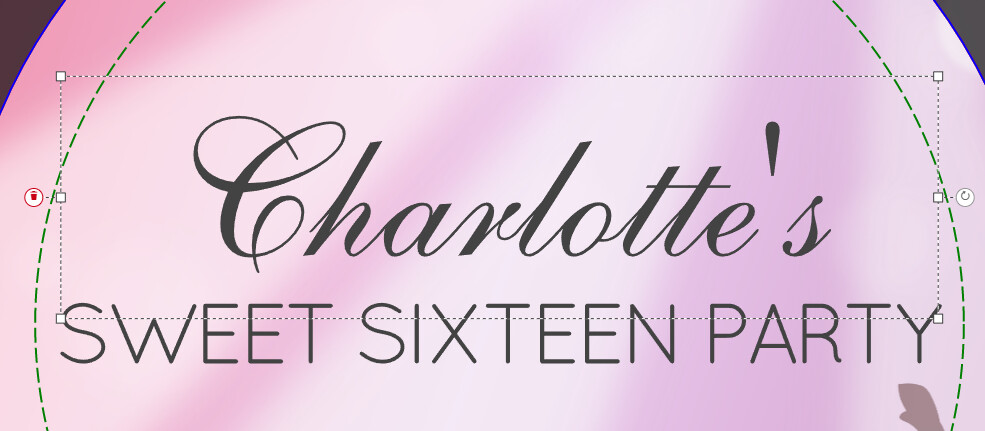
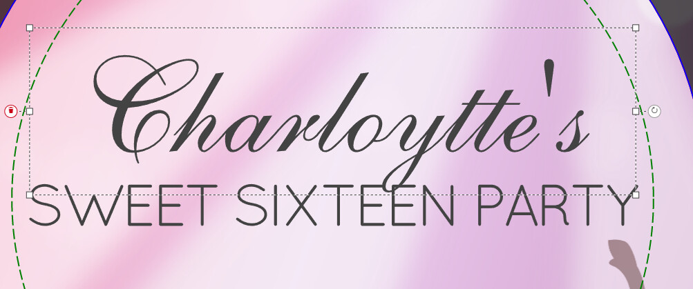
If you create template text for customers to personalize, always try it out with the letter “y” to make sure it doesn’t overlap with something beneath it.
For example:
This looks good right?
Wrong!
Doing a quick y test reveals there might be a chance of overlapping text.
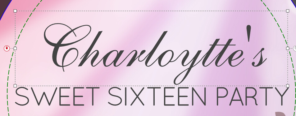
This is a bit better, just in case Lucy or Sally wants this product for her sweet sixteen party.
And the final product.
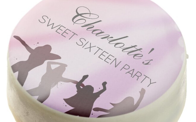
Part of my new Sweet 16 Ticket - Birthday Invitation & Supplies collection.
The name could even be moved a bit higher, but I’m ok with it. Can’t keep tweaking for hours 
22 Likes
I believe a Capital W and X are also worth testing, along with all the tailed letters.
8 Likes
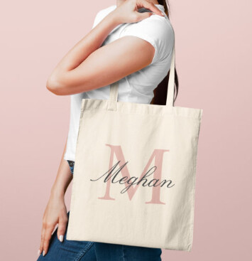
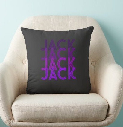
Though, these days an overlapping letter can actually be considered modern and cool. Not that I’m all that trendy!
1 Like
Very true, if it’s intentional.
Overlapping can give some creative results like these two designs:
1 Like
This is a great point! I typically test for width of a wide name or initial to make sure I have the font size right and bounding box at the correct width. I haven’t thought as much about descenders, like Y’s.
The initial I usually test for width is a W (if it’s a single initial), since they can be wide in scripty font, although I’m sure there are others. I’ll make sure to try the “Y” test unless the overlap for that design is intentional.
1 Like