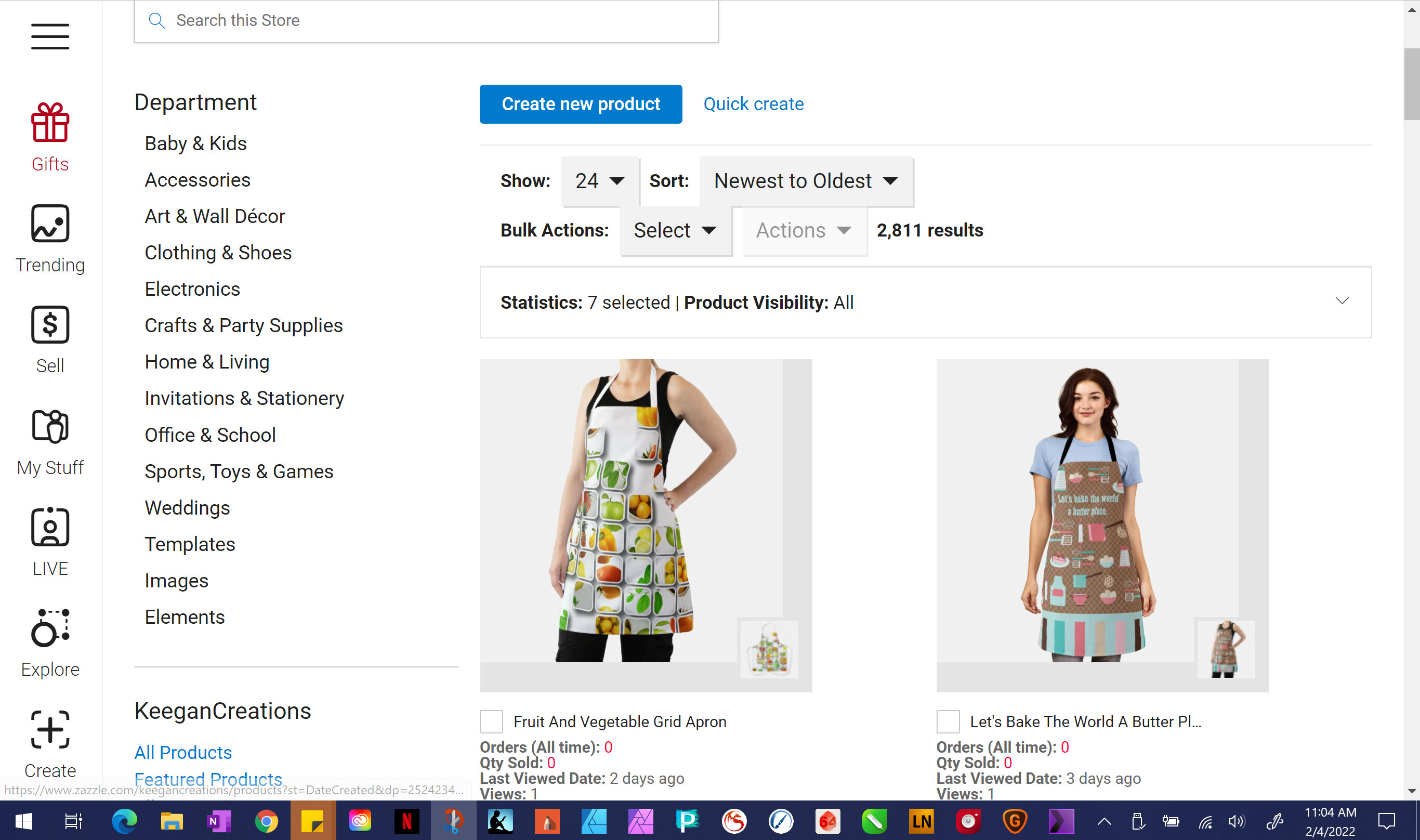
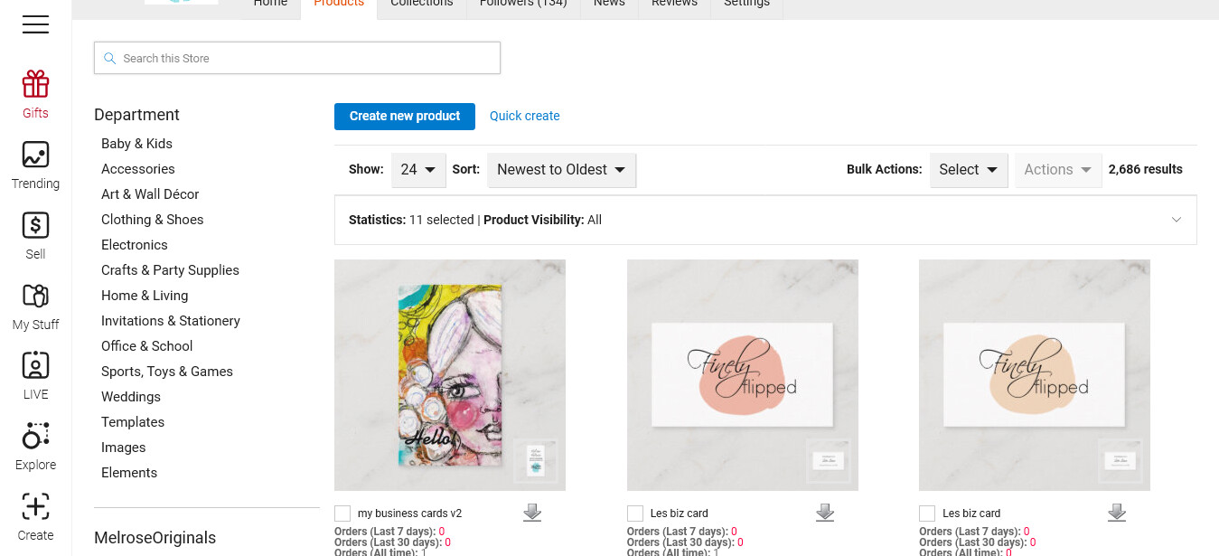
After the back end changes I now only have 2 products per row, giant thumbnails, no apparent way to increase it back to 3 or to more as others do. I use a Microsoft Surface Pro which is a cross between a laptop and a tablet. Could that be why I have gone down to 2 per row and can’t expand? Or is there a place where we can expand via a menu?
I am on full screen. I tried reducing the screen size and then pulling sideways as seen in the News announcement for this change. But it doesn’t work. Is this something that can only be done on a desktop or a full laptop?
I do not see any changes on my backend. My screen resolution is at the suggested for my (HP ProBook) laptop, which is 1366x768. I am using Firefox, but also checked on Chrome and Edge all updated to the latest version. I also cleared my cache to see if that would do anything and it did not.
ETA- I am on Windows 10
It looks like the whole page is zoomed in just a bit from the old version, but that might just be me.
+I have the same problem on the iPad. No apparent changes to the format with the exception of check box switching sides. . Still seeing three columns, no way to see more.
It seems that if I change the zoom on my screen to 80% I get 5 across. I am not sure if this is the intended way that this feature is meant to be used or not, but the font is far too small when I do that so I think I will just leave it the old way with 3 across.
Well, I guess there is nothing the tech team can do about this. It looks like the screen is now responsive to resolution so those of us who have our screens at 120% have to bring it down to 90% to see 3 at which point it is hard to read. Having to suddenly wear reading glasses just so I can see 3 products once again is not worth it. I’ll just scroll more.
I guess I’m just jealous that what made things better for others made it worse for me- and anyone else who had their screen at zoom for eyesight reasons.
I too have not seen a change in the number of items in a row. The share and actions buttons did change positions… and things look a little bigger… I figure that it might be an indexing type issue where it just takes some time for everyone to see more products in a row. IDK.
My tablet is also a Microsoft Surface Pro; at 100% Zoom in my browser, I get 3 products across, 4 at 90%. On the Suface, we can pinch and zoom to magnify the screen so you could magnify to show just the rows and columns and pan when you need to see the Department/Category lists on the left.
I can normally pinch and zoom on my iPad Pro. With the new Zazzle changes, i’m limited to two products per row. I can zoom, but I can no longer pinch to make the pages smaller. So I can’t see more items per row. I can’t see permanently changing the screen resolution to accommodate changes that one site makes to the detriment of all others when those sites all perform well. Without fixes on Zazzle’s end, navigating in the site will be permanently degraded.
We did the best job that we could to keep things looking exactly the same, so many users will not see much of a difference in how products are displayed.
Engineering is aware that tablet users may now only show two products per row. We’ll see what we can do here.