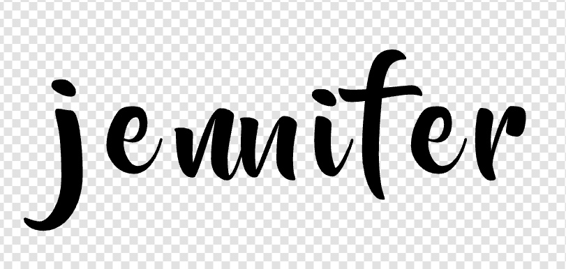
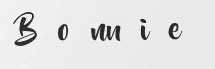
I received a message from a client by the name of Jennifer informing me that the “Beyond the Mountain” font i used on one of my invitations is not returning the correct spelling of her name. Instead of “Jennifer” which is spelt correctly in the template field, it appears as “Jeninfer” on the invitation. I have tested it and she is correct. She spoke to Zazzle about this and was advised to use another font. While this is reasonable, fonts are chosen to enhance and suit a design. My client is very peeved and thought i could offer a solution, which i unfortunately cannot as the only solution is to substitute the font with another.
Zazzle, as a client has already raised and addressed this issue with you directly, kindly let us know what the solution or work around for this issue is. Alternatively, as much as i don’t want to suggest this, please remove the font as it is not working properly and will lead to multiple cancellations and loss of sales for designers down the line.
I look forward to hearing positive feedback. Thank you
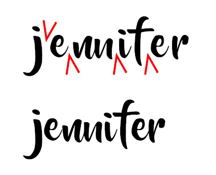
I tested this font spelling out Jennifer and it worked fine. It does look more legible if the characters are spaced farther apart. Because the “i” in Jennifer does not have a leading tail in this font choice, when positioned too close to the “n” before it, it is difficult to read. The Beyond the Mountains font is not a good choice for names like Jennifer unless you space the text out a bit more. The font is not broken, it works as intended.
Hi Scott. Yes, that does work but by doing that i have to reduce the font size by two sizes to fit it on the same line, reducing it to a size that does not work for the invitation.
I learnt something new today and will keep this in mind going forward (for my own use) but will not be using this font for invitations as it is impossible to recreate every name or place to see what letter spacing will work for each one.
Thank you for taking the time to take a look. It is appreciated.
Edited to include the spacing as produced by the font at size 14
There is nothing wrong with the font actually. Some extended fonts replace specific letter combinations with custom graphics, like in the case above you can see that the second letter N is different shape. This is done on purpose to make the font look more hand-written or more decorative. Plenty of fonts here on Zazzle use that, you just ran into an unfortunate combination with the name Jennifer 🙂
No, I think there’s something wrong with the font, and it’s the smattering of illegibility. Just as we speak to communicate, we also write to do so, and if we slur our words or smear our writing, communication breaks down.
If this is the “expected behavior” for this font, why would anyone use it, as this issue with double letter “n’s” would limit the number of people who could personalize products using this font. I will not be using it.
A lot of the free fonts are created by people who learned to use the free software for doing so. Anyone can do it, and lot of folks do. I’ve done it too, but this doesn’t make me an expert.
Thanks for posting this, if nothing else it’s a warning for others using the font.
Maybe for just for this one customer you could manually edit it? Break her name into chunks and make them each a separate text layer like Jenn i fer then manually scoot the letters into place, then “group” the layers so the name is one unit.
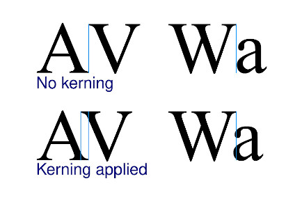
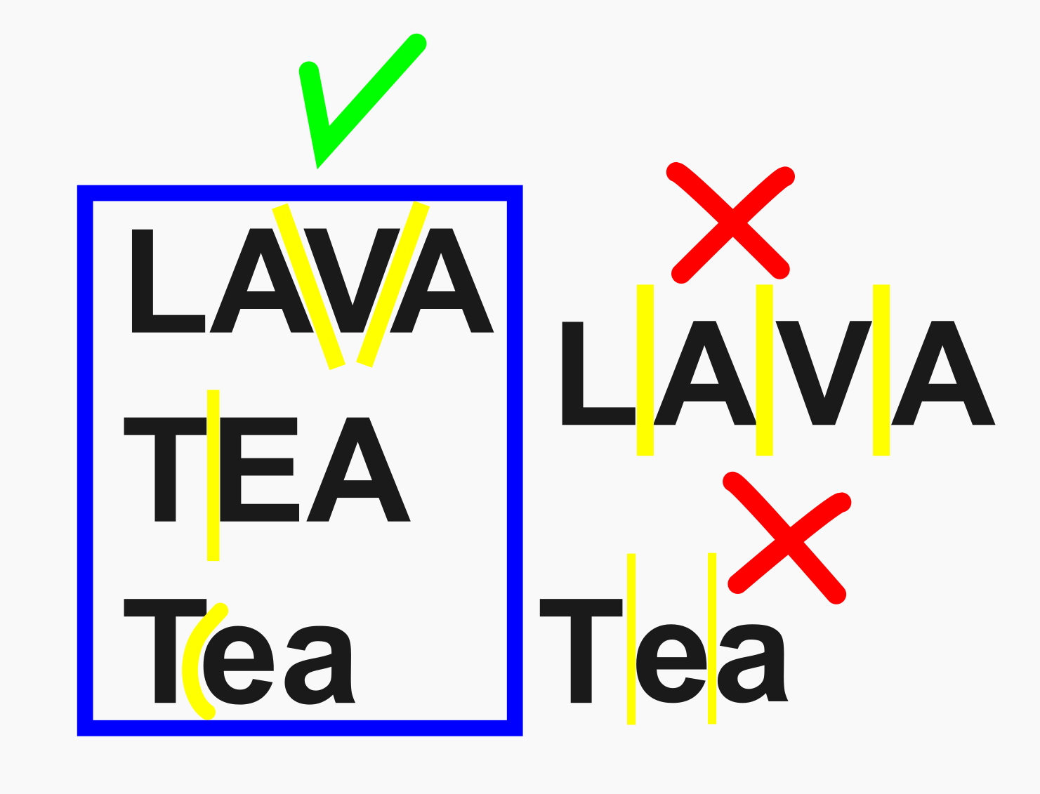
Thank you for this. I had no idea what “bad kerning” meant so i have searched for the meaning and left it here for others to learn from too.
What does bad kerning mean?
Bad kerning is thus text that has so much space between letters of one word that it appears to be two words, or so little space between letters that they run together. A common kerning issue is an “r” and an “n” together looking like an “m”.