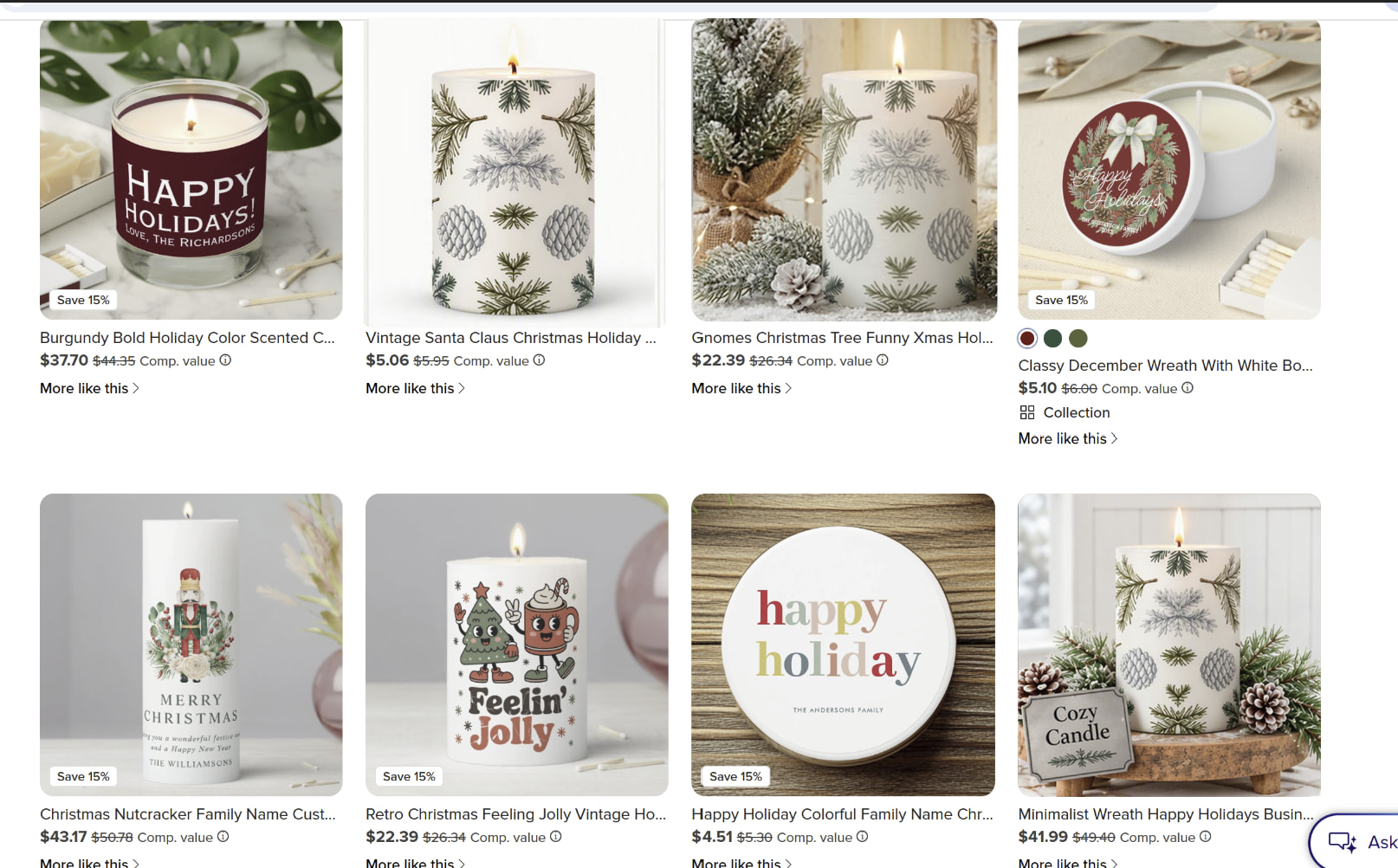
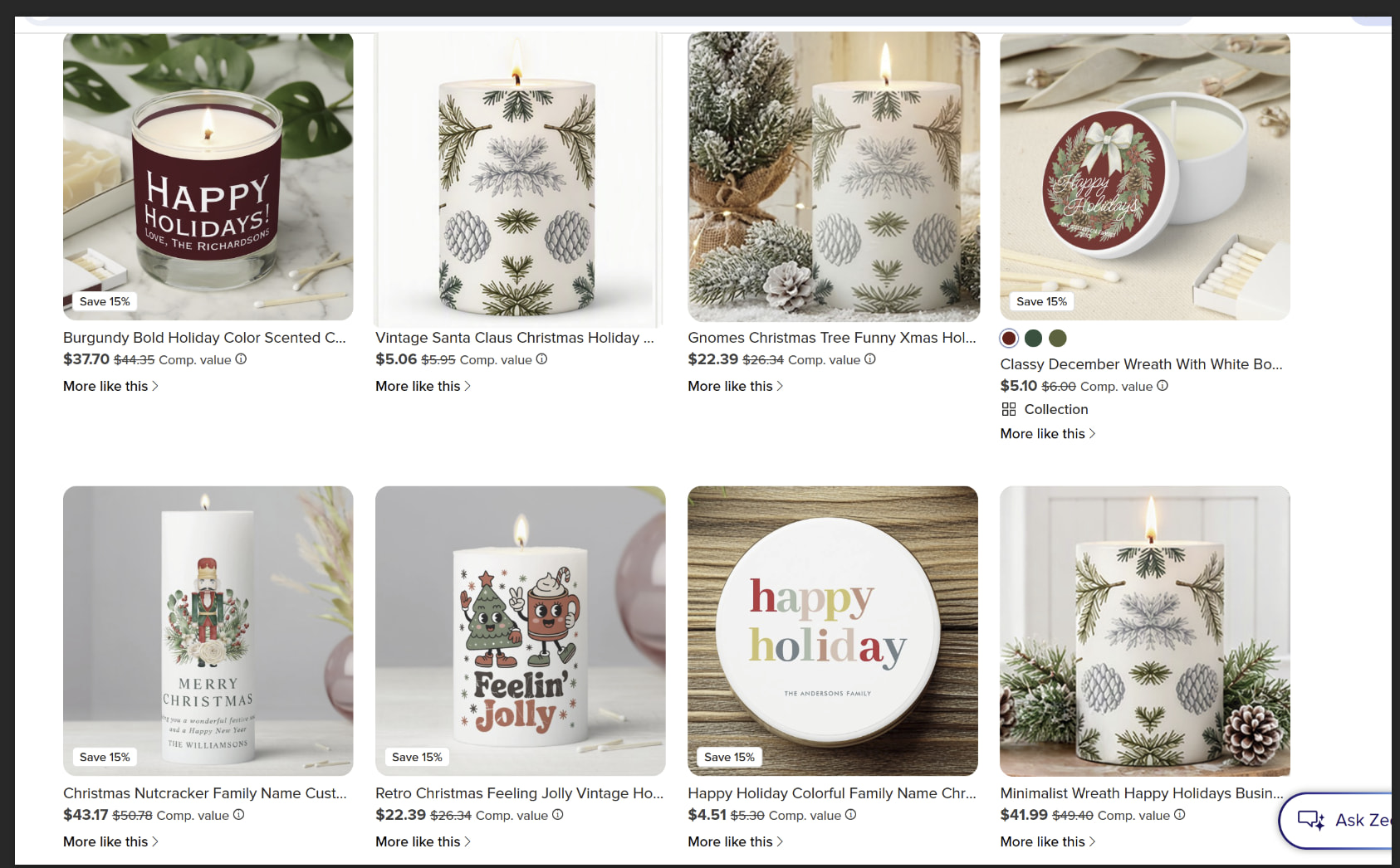
After a very long discussion about marketplace thumbnails, I thought it was time to let the creators decide.
Pretend you’re a customer quickly scrolling the marketplace. According to the much-discussed “½-second rule,” you don’t have time to analyze anything. So don’t.
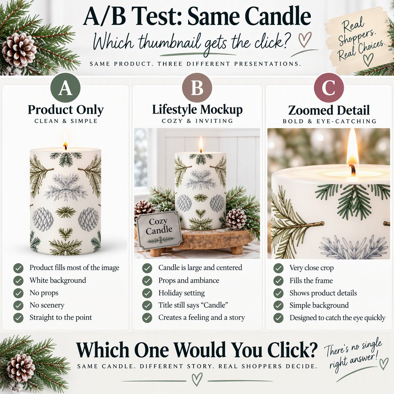
Look at the three images and immediately choose the one that would make you stop and click:
A: Product Only | B: Lifestyle | C: Zoomed Detail
No overthinking. Which gets your click: A, B or C?
And yes, our A/B test somehow became an A/B/C test.
B, although I’m wondering if it’s because the image is centered. I’m viewing it on my phone right now, so I’m not sure if it looks different on a computer (I’ll check later). But overall, B was the first one that caught my eye
Okay, here’s my thoughts, and they’re quite different from everyone elses. I had to stop and think why I kept coming back to the one I chose. I read the preface and I’m trying to be honest, so knowing that I’m trying to look through a marketplace as suggested. I assumed it was a crowded marketplace, like Zazzle’s is.
So, my answer was A. And here’s why: A is clean and simple with white all around it. It stood out to me the most out of the two. I want to find out more about it.
B, while it’s nice and inviting, and I liked the ambiance setting; I like to be inquisitive. Telling me it’s a “Cozy Candle” tells me it’s story right away, and I can move on. It doesn’t leave my mind questioning, hey, what’s that pretty candle all about? This part should be left in the description, after I’ve clicked onto the product. I cannot say if this works for everyone or not, maybe it’s me. I tried different ways of looking at it, I’m on a desktop, but I still love the lifestyle mockup. [A good chef’s secret weapon is always leave them wanting more.] Also on the mockups instructions originally, words were a “don’t do”. However, with the AI mockups now, I’m sure that technicality aspect is okay.
C, is just too close, magazine level, where I’m expecting to see more images on the same or next page, simply to see all of this pretty design. Unless there’s more pictures, like B, included, I don’t mind it. There used to be a technique for this, making you want to click to see more, but with 1/2 second rule, I’d be asking myself, do I have time? This could work only if it was seldomly used. I think the more it’s done, it can be overdone very quickly.
I actually see the “Cozy Candle” sign a little differently. I don’t think it tells the shopper the whole story or removes the reason to click. I see it as part of the marketing in the mockup. We use phrases in promotional images all the time, not because we’re giving away everything about the product, but because we’re helping the shopper make that connection.
“Cozy” was intentional for me. My keyword research shows people are looking for that concept in home décor, and I’m not trying to tie this candle to a specific occasion or event. I’m creating a use for it: a cozy reading nook, a glass of wine, a quiet winter evening, a candle burning beside you. I’m trying to make the customer imagine wanting that feeling in their own home.
There was also a practical reason for the sign. In the earlier discussion, people questioned whether I was selling the candle, the stand or the greenery. “Cozy Candle” makes the actual product pretty hard to misunderstand. So for me, the sign isn’t explaining away the candle. It’s doing what I want a lifestyle mockup to do: identify the product while helping create the desire for it.
Both A and B are centered. A is the product mockup staged on white, while B is the lifestyle image. So if B caught your eye first, something in that visual imagery attracted your eye, and that’s really my point. We don’t necessarily stop and analyze why something catches our attention when we’re shopping. It just does, and getting that first glance matters.
I would choose B, but zoomed in more so that the bottom of the candle is as low to the thumbnail border as the flame is to the height of the border and possibly off to the side (if that makes sense) - and I think you’re highly exaggerating what I was saying on the other thread about zooming in. These are extreme cases middle lifestyle photo are against (with the blank and the overly zoomed in one)
Edit: And this candle better bring a lot of sales for you after all of this ha!! : )
LOL, at this point that candle owes me money. I understand what you’re saying about zooming B in more, but I went back through the marketplace and looked at the thumbnails again. They’re really not as tightly cropped as what you’re describing. I think if I bring the candle in too far, I start losing what makes B a lifestyle image in the first place. And the interesting part of your answer is still that B caught your eye first. I was certain you would say A
I truly like your original photo (the 3rd one in the top) like this : ) I don’t think the props are an issue at all. Just zoomed in more than you had it really does something (for me anyway). Maybe I’m just weird and zoomed out photos are all the rage and suddenly users click on them more ha!
PS: No (about the white background lol) - I said that in the future with everything being AI and every one of these images being lifestyle images, then, yes, the white background would stand out.
Edit (again): Just for fun, I wanted to see what your newer mockup looked like centered and larger and without the “cozy candle” thing. This one is really pretty centered and larger, no? Bottom right.
I like B but I also like C and the reason I like C is because it shows the detail in the candle artwork. I created that candle with an embossed enamel simulation prompt and C shows that, I would add C as an extra view on my product landing page.
I would click A and probably not the other two. A is clean and simple allowing me to actually see what is being sold. B is too cluttered for me and C is too close. I am a bit of a minimalist though.
That would probably get clicks not only because it’s beautiful, but because users would be curious about how the rest of it looks - so that would be a good thing too. It would be really interesting to see the results of an A/B test for this.
I would vote for A or B for the thumbnail, because seeing the candle’s proportions is important to me. C is too close.
I think having all 3 views available for the product page is helpful. I want to see the simple version, how it’s used in situ, and more details before I finally buy. If Z doesn’t offer a closeup detail photo, I’ll often include one with the product although usually not as the thumbnail.
One thought about B is that Zazzle offers products in some other locales. Text in pictures likely isn’t localized, but I’m not sure if that would impact a purchase decision in a country with a different official language. I’d make sure any essential text is included in the description so that it’s translated. Nice mockups, by the way!
From an aesthetic point of view, B looks very pleasing to the eye. It will merely be liked. However, when it comes to getting a click on the product, a customer will click on C without a second thought just to see what the full design looks like. That’s what my experience has been so far.


 I understand what you’re saying about zooming B in more, but I went back through the marketplace and looked at the thumbnails again. They’re really not as tightly cropped as what you’re describing. I think if I bring the candle in too far, I start losing what makes B a lifestyle image in the first place. And the interesting part of your answer is still that B caught your eye first. I was certain you would say A