Did this forum come with a search box? I feel like an idiot for not being able to find it. Surely a community forum that will get jam packed with info in a short time will have a search box built in, right?
Check the home page.
We’ll be adding it to more pages in the future.
2 Likes
I totally agree! I’m less lost than frustrated. Oh, I can get around in these forums–I’m no Luddite, but I don’t like all the meandering and the clicks and scrolls it takes to get where I’m going. And, when I get where I’m going, I too often find it wasn’t worth the time and effort. The old forums conveyed more information at a glance than this one does with more “work”. These forums are the very kind of thing I avoid on other sites that I only consult when I have a very specific problem, not the kind of thing I expect to be able to read daily to learn from. All I can say is I’m glad I’m not a Zazzle newbie and I can’t help feeling Zazzle threw the baby (info) out with the bathwater (appearance).
But, alas, we’re stuck with this new format. I can only hope that with the additional developments Scott says are in the works the emphasis is placed less on looks and more on real utility. (Then again, what I really wish is that the chinks in the platform were fixed instead.)
2 Likes
I’m not sure why a forum needs to be designed primarily for mobile when most graphic designers are working from computers, not phones, and are likely accessing the forums though computer browsers. Even my ipad pro is using a standard browser and not the mobile browser. Maybe I’m wrong and everyone is only using phones to go to the forum? Surely zazzle has the stats on that.
1 Like
I have to agree that the most important features of any good forum were left out for the sake of “appearances”, especially when the appearance of the new one leaves much to be desired. Also, I can’t understand why anyone would delete a huge thriving forum and not roll all that history over into a new space first. The old forum represented countless hours of valuable time and priceless information invested by community members over years, so sad to see it just get left out as though it has less meaning than a new template style with less functionality. I personally think this was a bad decision and if there is any possibility of going back it should be seriously considered. And at the same time to be having so many technical problems within our store backends that still aren’t fixed like not being able to move products into the proper categories, collections showing up in the wrong stores, products not changing visibility, and so on is more than frustrating.
2 Likes
Thanks! The one page I didn’t check lol.
HI everyone,
We didn’t bring over the old post because there was a decent chance that would have been a huge mess. The way post attribution was designed back then compared to now is incompatible. Then there’s the quoting, which wouldnt have carried over. Same with product shares (old forum used BBCode and this new one uses HTML). The engineering costs associated with bringing these posts over would have been immense, and there was no guarantee that the posts would have been very readable. Finally, the SEO capabilities in this new forum, with its newfangled technology and tools, did encourage us to start fresh to ensure that our posts would surface in search engines more favorably. In the end we had to balance all of the items above, and unfortunately we made the decision to move on. We still have all of the old forums available internally, and hopefully soon we’ll start adding back some of the old reference information for everyone to use.
The appearance here is still not quite polished, but we’ll get there as soon as we can. I don’t know where the comments about this being a mobile site came from, but I dont know if I agree with the takeaway there. This site is being designed first for desktop, then we’re reviewing it on mobile.
Finally, none of the store backend problems have anything to do with the new forum. Those issues are being worked on by a completely separate team with a completely different skillset than the one that has been working on this new community. In other words, this new community is not slowing down progress on anything else, and the two teams are not compatible at all.
Last Friday I was in the process of writing a post describing the plan for the forums moving forward, and why things are in their current state. This post was eaten up by my computer overnight as it decided to run some updates + reboot while I was asleep. I hope to have an update posted later tonight.
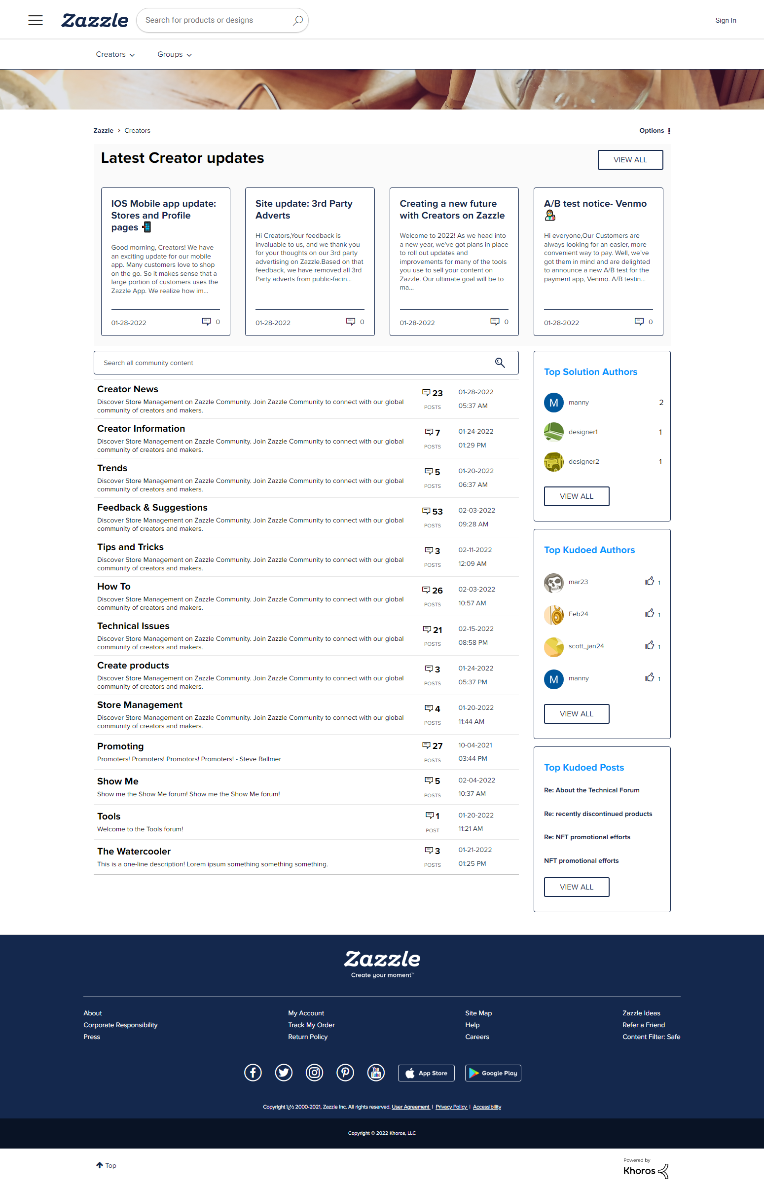
For now, here’s a look at what the Creators hub might look like very soon. This is the page you see when you click on the Creators link in the top of the page. We’re still discussing and tweaking things a bit here, and I’ll be adding a pod on the right side of the page with some quick references for Creators. The takeaway with this screenshot here is that we’re working on cleaning things up and making the site more usable - less scrolling and more information on the page. The screenshot below is from my testing environment so it has a bunch of dummy data and placeholder articles and forums/forum descriptions that are inaccurate compared to what you guys will see. Please ignore that. Generally, I’d focus on the structure of the page - the content available here, and the format that it’s presented in. This means: recent news, search, discussion forums, and references all within reach. If you visit the community several times per week this will likely be the page that you’ll want to bookmark. This update will be pushed live as soon as possible.
I hope to share more updates later this evening.
5 Likes
AMEN!
1 Like
I like that format a lot better. It looks like it’s already live. Was that always there?
that looks like a good start… my one question is do we really need the three side bar sections on top solutions or kudos? I really wish that space could be used for something more useful like related posts (with same tags) or notifications ( that little pop up thingy is super distracting and then it is gone…) These suggestions are probably not possible… I am just dreaming. I realize you are working with a 3rd party platform which probably limits what you can or cannot customize. Anyway thanks for your hard work and the update.
That screenshot is a massive improvement for sure!
I know it’s been a lot of critique by everyone, especially considering that it’s still a work in progress. For a lot of people it’s like coming home one day to see someone completely redecorated your house to this sweet new minimalist decor, but in the process took away all your most valued belongings lol. I understand the logistic nightmare of moving the old forum, but would it maybe be possible to archive it separately and keep it live as a searchable library for us so we don’t have to lose all that value stored within? Just a thought.
1 Like
The sidebar is far from finalized, but something like related posts wouldn’t really fit well on a page that’s meant to display a forum listing. In the future the sidebar may look like this:
-
short text-based list of references/ideas about the upcoming holiday (to be used in conjunction with our recently released holiday calendar)
-
notifications/user actions.
-
short text-based list of featured articles to be sure people aren’t missing the good stuff.
-
possibly a ‘mark all forums as read’ button.
1 Like
That sounds good, looking forward to it.
Also while I am here I would like to second @DE0 's idea about the old forum being archived as read only just as a source of information so we don’t lose all the stuff that you guys don’t have time or space to add here.
1 Like
Hi everyone,
Just joined this beautyful community today and thank you Zazzle for creating it.
zazzle.ca/store/viepure
Totally, lost and confused. Not even sure what I am looking at. Such a cluttered page and all these older dates. This seems like it took something that worked easily and well and made it more confusing and difficult. Hard to find anything easily or quickly. How does one get to all the current postings?
2 Likes
@whatawonderfulworld To see the current postings, click on “Topics” on the left hand side

then click on Activity (right hand side) so that the arrow points down

and make sure you have “Latest” underlined

the older dates are when they topic was originally created
1 Like
Sara, thank you for sharing your expertise with me–I sure do not have any! I will mess around with this and see how I do. I think I will still feel that this new forum is way too cumbersome and for me, takes valuable time away from when I could be designing–it just seems there are more hoops to jump through just to read, post or respond to others’ posts. It should not be that involved to do what we used to do so easily. Seems as though many of the new things that zazzle comes up with make things harder, not easier or better. Just my frustration speaking, perhaps.
2 Likes
MasterpieceCafe, sounds like you are experiencing this new forum the way that I am (a lot of extra clicking and unable to find anything). I also do not understand all the old dates to the far right or some numbers that show like across from yours just above where it has 10/37–what is that? How do we get rid of most of these old threads that are cluttering up the place and al the stuff on both sides –just looking at the page makes my head hurt it is so busy! But I do appreciate those who are “getting it” and willing to offer help for the rest of us who are struggling. Thanks to all of you.
2 Likes
I keep trying to figure out this new community for 2026, but every time I search, it keeps giving me articles from 2022. My honest opinion is that it would have been better to update the old community very professional looking community instead of changing everything. This new setup doesn’t feel professional to me. It feels like too many steps, too many clicks, and it’s hard to find new not 2022 topics. It takes way more time and effort than it should.And considering we’re posting our concerns on a thread that’s four years old, I think it would have made more sense to start a new topic for 2026. It took me days to find this new conversation because it was buried inside an old thread. So yes I feel lost… but I am here daily trying to figure things out.
2 Likes