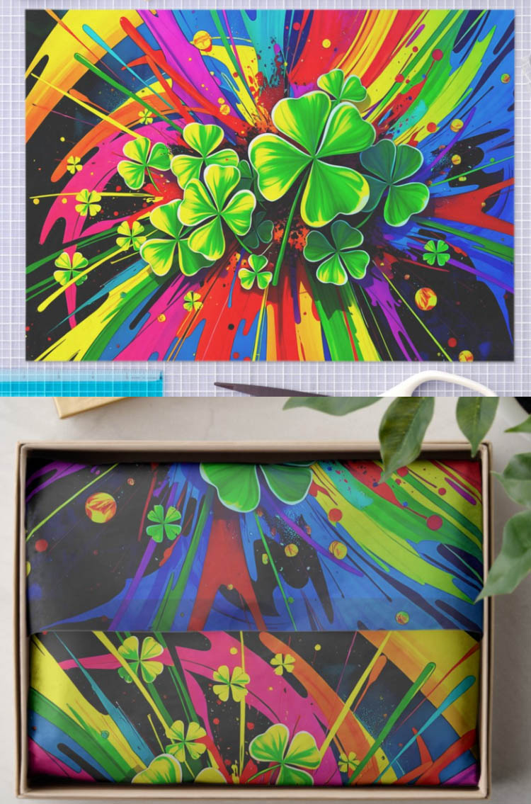
When I made covers for my tissue papers I did my best to adjust the colors to match those of the Zazzle-provided previews rather than the slightly more vibrant colors shown inside the Design Tool. This new Gift in situ does not match the colors as depicted in the rest of the previews, it’s darker and duller and just ehhh, not attractive at all.
Second issue for me is it depicts a perfect parallel meeting of the left & right edges of the design. Which for the thousands of designs that aren’t a seamless repeating pattern looks awful. I’m guessing this preview is supposed to represent a gift perfectly precisely wrapped in tissue, inside a gift box. (But my very first impression seeing it was it was a decoupaged serving tray or desk organizer.) In my life experience no one is using tissue paper in a way where the edges need to match up; it’s stuffed in a gift bag with parts artfully sticking out, or it’s used in craft projects. This depiction here is a real turn-off.
That said, I love the new Craft preview! That one’s acknowledging that people are using tissue paper for crafts not just gift wrapping - and the colors match the rest of the previews.
Thanks for pointing that out. I like the craft preview too.
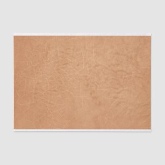
For anybody who has designs that are not repeating tiles- review your designs. There are a ton of new sizes and it seems in the transfer of old to new tissue paper, sometimes there are white edges. If you see that, you are likely to find a new size that removes the white edges. I had a bunch of non-repeating designs that got put on 10 x 14 and had white edges at top and bottom. But switching to 10 x 15 fixed that.
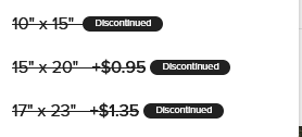
@KeegansCreation I have a feeling that the old 10 x 15 size will be discontinued (along with the other previous sizes - 15 x 20 and 17 x 23) as they don’t have the new mockups (no proof - just a hunch)
I do love that we have new in situs for tissue paper, so thank you for that. But I will add some thoughts.
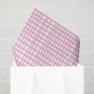
I would love to see a little more definition in the white ropes on the gift bag. It’s very hard even with editing, to get those white ropes to show up nicely. As it is they blend in with the white bag a little too much. And as for the product, the product shows as gray when, in this case, it should show as white. This is my pink grid tissue paper, which is pink lines printed on white paper. I have added no background at all to my product, and the product should show in the in situ as pink lines on pure white. If it’s possible to make some adjustments with this in situ, I would be most grateful to see some improvement. Thank you.
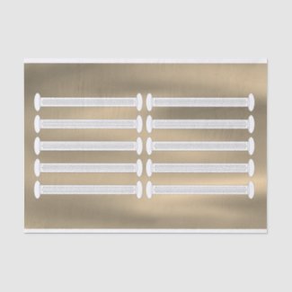
What’s worse is that after Zazzle made changes with tissue paper, all the tissue paper in the marketplace went horizontal. Mark flagged this to your IT / engineering department. I hope it’s fixed soon because it looks absolutely horrible to potential customers.
I don’t like how any of my designs look now and I can’t remove theirs.
Have they done away with the 18lb tissue paper? When I go to create your own now it isn’t showing up. This will destroy the decoupage creators. What a mess.
I wish if they were going to change the sizes they would add the A4 size.
I have people messaging me asking me and I have no clue. lolol
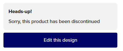
When all of designs are clicked on this is what is showing, and I have almost 3400 designs.
I know things change and I get that but is there a way for Z to go in and remove the discontinued sizes and let us be able to edit the situs photos?
With that many designs, customers freaking out thinking everything is sold out, my health which ism well you really don’t want to know, I find this a daunting task. I love Z but as a creator/designer we sure do need Z to help us on this. You have no idea how much it would be appreciated. This has literally taken the wind out of my sail.