Currently when we look at out product insights, the pie chart breakdown of views is color-coded in such a way that the most populated type is
always blue, then green 2nd and yellow 3rd.
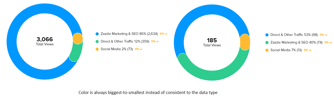
This is not a helpful system for comparing two pie charts as I have done above. I cannot easily compare direct traffic, for example, since they are two different colors.
It would make more sense if marketing was ALWAYS blue, if direct traffic was ALWAYS green, etc. Comparing different charts would be much more intuitive and informative