Dear Tech Dept.
You are doing a FABULOUS job with all of the new changes! Yay!
As DESIGNERS, our store FRONT is our MAIN advertisement. I’ve noticed that
on all of the store images that look very crisp, clean, elegant, and white, as I upload
my images to my store front, the quality seems to be lost, and especially the whites
becomes greys. Hmmmmm, & I’m assuming there is an automatic gradient added to
our images. Please consider REMOVING this and allow our images we’ve worked
so very hard to create for our product images and store front to be EXACTLY what
we created. Please, consider and respect our images. Thank you kindly.
25 Likes
I agree. The gradient on store banners has been problematic for me, too.
yes, please.
I don’t know how many times I’ve posted this same suggestion over the years. 
Hello @nyclosangeles et al,
Thanks for sharing this with us and for your input. I’ll pass this along to our team so that they can review it further.
All the best,
Pádraig 
I am not sure I know what you mean. Is it that there is a darker shadow at the bottom of the banner. I have many banners that are in a gray gradient so I might be missing it. I did notice my wedding shop seems to go from a darker overlay from the bottom to none at the top. I actually think that this is a very pleasing and professional looking. It might only be me that sees it as a good look. Perhaps the best idea would be to have the option to use the overlay or not in the settings. I expected to see an overlay with the words Zazzle across the banner. Again not sure what the issue is.
I asked for that a few years ago!! 😁
Yes I would like the gradient removed from the banner as well
Thank You Team Z for choosing to RESPECT our ORIGINAL image uploads NOW and in the FUTURE!!! We GREATLY appreciate all of your TEAM and what you do DAILY for us that we DO NOT SEE or MENTION. We know that BEHIND THE SCENES all of you work VERY HARD to make ZAZZLE run, succeed, and flow through ADVERTISING, MARKETING, MEDIA SITES, PRINTING AND SHIPPING SERVICES, MANUFACTURING. We are very GRATEFUL! Thank you to EVERYONE on Z whether in FRONT of the scenes or BEHIND the scenes that MAKE THIS HAPPEN for us!!! SHOUT OUT TO the ENTIRE Z TEAM!!! @Padraig
I, too, have wished for gradient on store banners be removed. I look at the store banner as our"front door". We all know the old adage and good advice, “don’t judge a book by its cover”, but reality is that first impressions can matter to some people and if our “front door” (banner) looks bad, they might assume what is inside is not of the highest quality even though they would be wrong.
Yes please, I would love the gradient on stor banners to be removed.
Dear Zazzle & Moderators…
I have not forgotten about this issue.
Please take action to remove the “overlay on front home page store banners”.
The banners on collections are fine & we do appreciate your respect.
My store should be how I want it to appear, not how Zazzle thinks it should appear.
Let me help. Send this message to the coding html website dept team.
They know exactly “how to remove it”. They “coded it in”.
In the meantime, I’m going to educate myself on how to remove it.
This is a very serious issue and feel that my design is being disregarded and disrespected.
Please don’t be insensitive to designers and keep putting this issue off. Bring it up in the next meeting.
Zazzle improving on other issues does not make up for the lack of addressing this one.
Please!
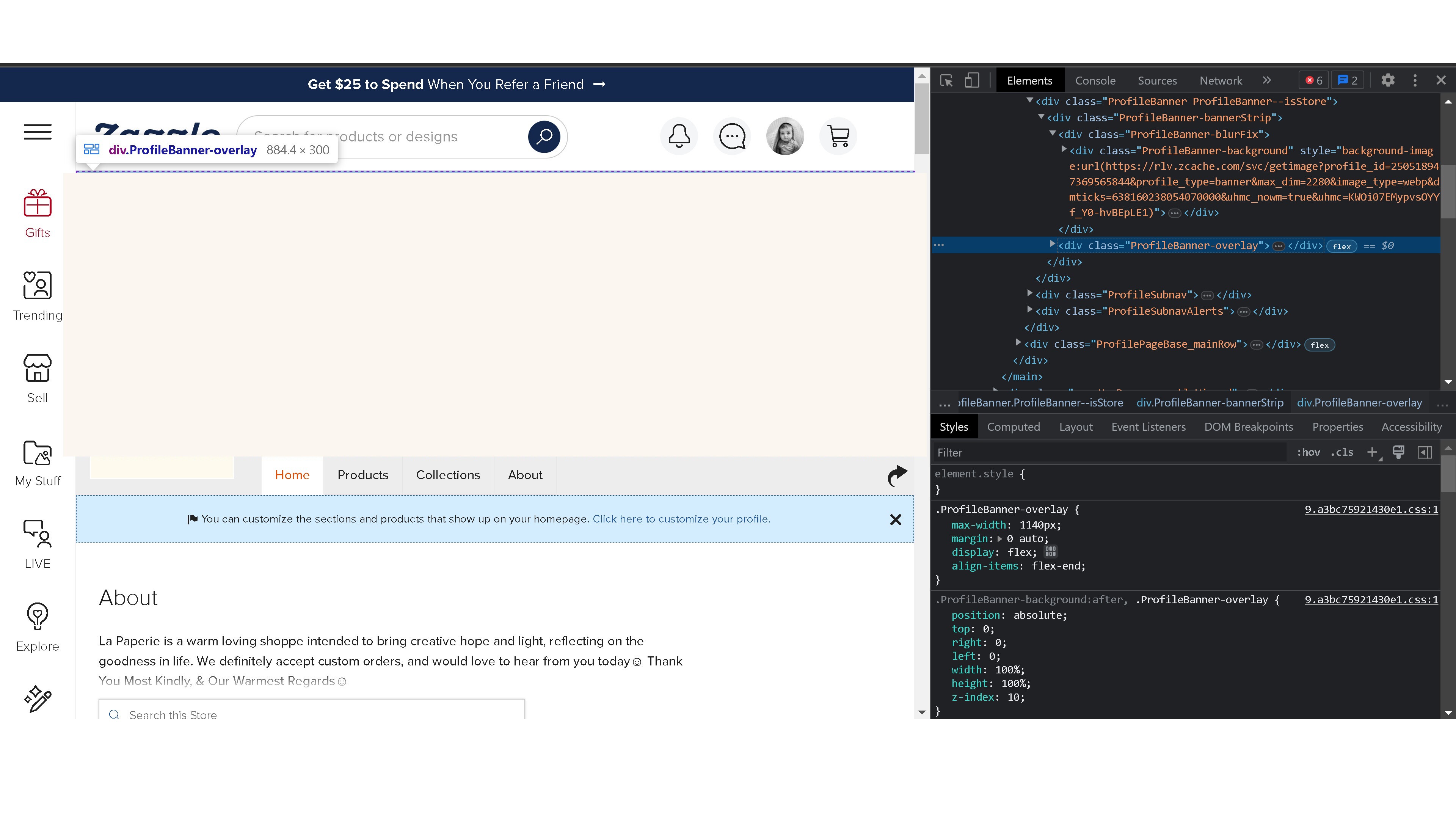
This is an image that depicts to the far left the " ProfileBannerOverlay" element that has been purposefully “coded in” and can most certainly be “coded out” 🙂 Thank you Zazzle moderators for doing more than “passing it on” and actually moving forward to “take action” . Please respect our designs!
I’m so glad to find this issue addressed. As a new Zazzle creator, I wasted a lot of time loading multiple banner files thinking that something was wrong with my files because of the gradient appearance. I, too, vote for removing it.