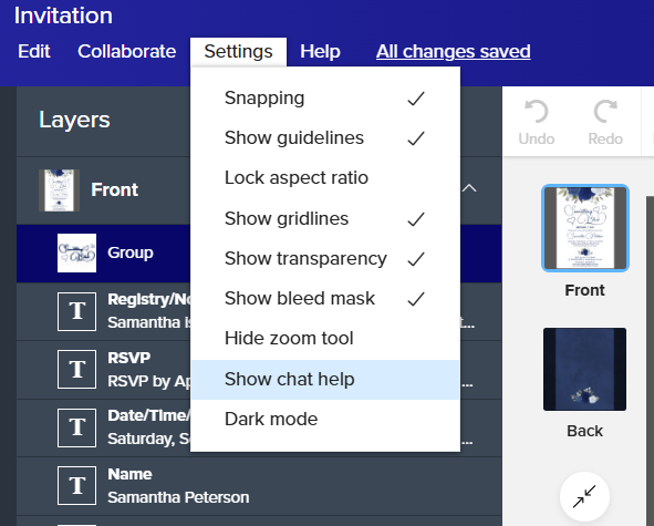
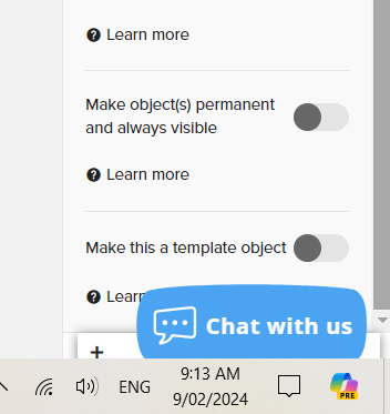
The annoying blue ‘chat’ bubble! It appears right over the template form and I’m starting to make mistakes because I can’t read the form properly with this in the way. It’s so annoying. 😝 Thank you.
28 Likes
I disagree. I’ve seen a big decrease in the number of customer service related questions that I get through chat since this blue bubble came on board. Personally, I am more than happy to trade the few seconds I have to spend scrolling past the chat bubble for the hours that I would otherwise be spending answering questions that should go to customer support.
I’m not saying get rid of the chat - just the annoying bubble covering the essential information you need to see. By all means even keep the bubble - but put it in a less intrusive spot on the screen somewhere that isn’t covering up our work space.
Sorry if I overreacted. I guess I’m just soooo tired of having to field customer support questions that I’m fearful of them taking it away! 😨
Looking at the screen, I’m not sure where else they could put it so it would be obvious to customers but not covering something up. Maybe at the top in the blue empty space?
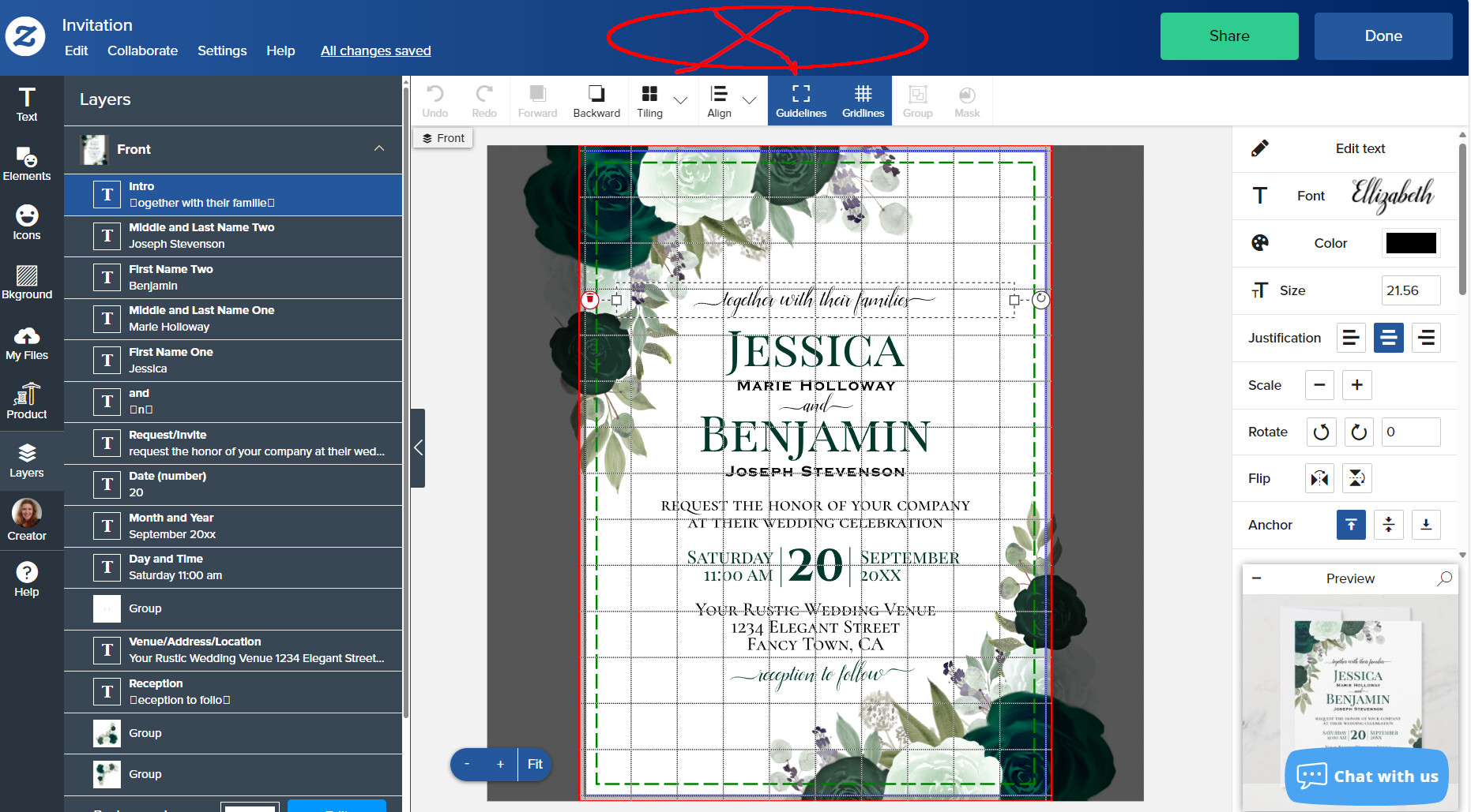
I was wondering if it lives where it does because that’s where the chat box opens up… so I clicked on it just out of curiosity and it disappeared completely! I don’t know what that means. Maybe it’s just a decoy and there really isn’t any way to chat with support? Maybe they’ve gone home for the day?
Well, who knows. Anyhow, sorry if I was snarky.
Why not put an x in the upper right corner of the blue bubble so a user can close it if not needed?
Hey all,
Thanks for your feedback and insights here. I will let the team know.
For me the immovable chat bubble usually appears over the “Done” button when I’m editing an item. It makes it nearly impossible to submit the form. It’s super aggravating. Maybe make the bubble movable so that we can get to crucial button that it may be obscuring which I’m guessing is different depending on one’s computer/phone/tablet screen size or browser.
Not a problem, @Cat . I didn’t think you were that snarky - it’s all good.  Yeah, the screen real estate is getting very busy these days…but anywhere else for the bubble except for right over the actual design tool area, or preview screen would be good.
@Mark thanks for your help.
@Zorinda I would have kudo’d your post except I can’t see either a Reply or a Kudo button on this page under any of the posts anymore?
@WHS_Designs Excellent idea about the option to close the box altogether, even if it keeps reappearing every time we re-visit the page, as long as we can temporarily get rid of it while we’re working, that would be a big plus.
Please move the blue chat bubble, off of the preview or at least give creators a way to turn off the chat feature, in the settings under the advanced settings.

Yes! I can’t see the product as I make changes with my patterns and designs.
It may be now moved left of the template preview, but now the chat help button (during daytime hours) falls right ON TOP of the Font drop-down menu, concealing the last couple choices and making it hard to click on those.
Some Zazzler told me to turn it off in “settings” but I find no option to do so. 🤔 I think an option to close it or a setting in advanced options to remove it from design board would be desirable.
@BevStuff It’s the second to last option in the settings menu inside of the design tool.