I wanted to share a “lesson learned” from a major order cancellation I experienced today, in hopes that it helps other designers avoid the same trap and perhaps flags an issue for Zazzle management to consider.
The Situation: A customer transferred my invitation design onto a can cooler. Because the original invitation had a background on the front/back layers, and the customer then added a background to the “Background” layer to cover the bottom of the can, the final product likely printed two layers of dark charcoal ink.
The Result: The “double printing” essentially choked the design. The text became unreadable and the elements appeared very pale/distorted. My assumption is that the layers overlapped in a way that affected the ink saturation or curing.
How to Avoid This: After investigating (and a shout-out to Cool’s Creation on Discord for the insight!), here are the two ways to safely design a dark can cooler:
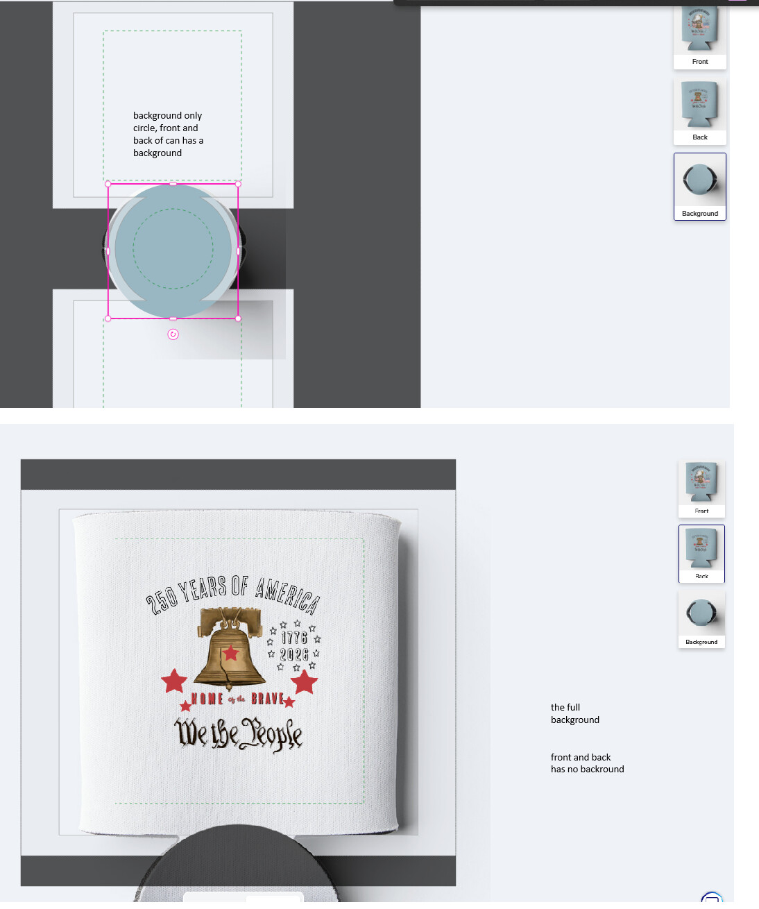
Option A: Apply your background color/image to the Front and Back layers only. Then, on the Background layer, use a simple circle/shape to cover the bottom of the can. Do not fill the entire background layer again.
Option B (Recommended): Use the Background area to cover the entire template (front, back, and bottom). Then, ensure your Front and Back layers contain only text and decorative elements with no background fill.
The Resolution: I spent the day optimizing a new design for the customer with a single background layer, reinforced strokes on the fonts, and larger elements. The customer has ordered a single “test” can of the new version, and I am hopeful the print quality will be perfect this time.
Suggestion for Zazzle: I have reached out to support to suggest that the design tool flag a potential quality issue when a background is detected on both the primary layers and the “all-over” background layer, especially with dark colors.
I’m attaching examples of the two ways to correctly set up these files below. I hope this helps someone else avoid a stressful cancellation!
you are welcome , hope it helps someone else as I almost made the same mistake that my customer did, thanks Cool’s Creation again for pointing me to the right direction
Zazzle should come up with something so that a person does not add a double background color. This would apply to other products as well. This was very helpful.
Are you certain that the double background is what caused the issue? My understanding has always been that ONLY the visible layer will be printed. Of course that does not mean something has not changed recently since Zazzle can’t stop “fixing” things that were never broken
Some years ago now I ordered about a dozen can coolers. For that design, I had applied the same all-over background fill color to the Front, Back, AND Background layers. The background color of the design came out way darker than expected and the color for the graphics I had added on top of it were all off, very faded looking.
At that time I posted to the forum about it. A Mod suggested it may have been a color profile issue. I spent hours on the case, checking and converting my color as RGB vs CMYK and looking at other can coolers in the MP plus other products in general with same general color I was striving for. And nothing was adding up. It took about three months but I eventually ordered another single can cooler with same design as test, only difference was I left the Background layer transparent, no fill color. That one came out as expected, a close match to the color I saw on screen.
My conclusion was that the Background layer is like the first layer of paint laid down, and then the Front and Back layers are more paint on top of that. So Front and Back colors are affected by the base color of the Background layer. I couldn’t know what the actual print process is for these but my experience was enough to convince myself that you should only add to the Front & Back OR Background layer, but not both otherwise it doubles up.
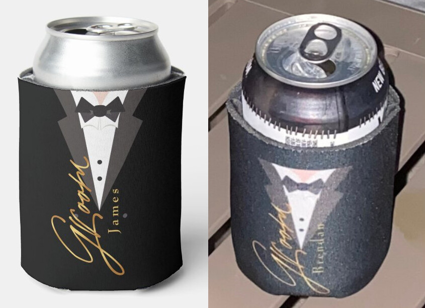
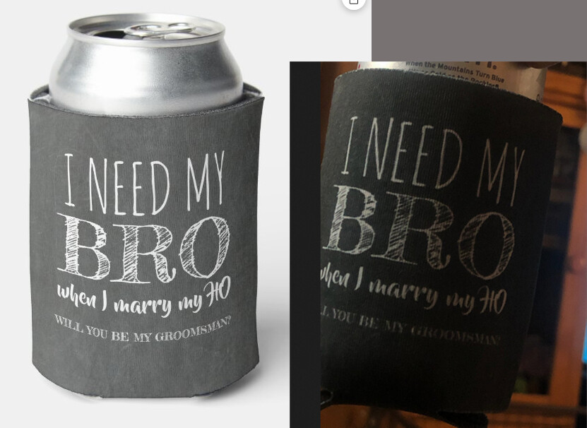
I did go and look at reviews for these. Was difficult to find ones where the design was all-over dark + had a link back to orig product to compare, but I found these two, and both of these had the background fill applied to Background as well as Front & Back layers.
And there was another review where the said they loved the design but it was DARKER (their bold) than the previews. That one also had the background fill applied to all layers.
I can’t prove what’s happening with the print process on these but circumstantial evidence is enough to tell me not to overlap layers on these - use the Front & Back OR the Backgound layer, but not both.
I’ve never had can coolers printed, but it looks like the blank product’s underbase color is white. If they were using a CMYK subtractive printing process, a dark underbase would ruin the top layers. If they are printing the background color first, then they could be using the same way they print the “Vivid Printing/White Underbase” for t-shirts, where the “fabric is treated with a white base layer under the design, allowing the design to be more vibrant.” However, that doesn’t account for printing the background twice. 🤔
Thank you CoolsCreation, the first image you posted was similar to print that customer sent me. I think you are right and the customer transfer and adding additional layer could cause the very strange print. Since I created a new can for the same customer and one was ordered, I will report about the print of the new can , which I hope will be fine as only one background layer was applied.
Update: The 100-Unit Cancellation is Back! (Success Story)
Hi everyone, I wanted to share a quick positive update on the situation I posted about previously regarding the cancelled 100-unit can cooler order.
After the customer had a “bad print” due to a technical layering error (double backgrounds) when transferring my invitation design to a cooler, I simplified the product’s back-end—locking the background only one layer, and reinforcing text.
The same customer just came back and re-ordered all 100 can coolers! This confirms that technical fixes and “customer-proofing” our designs really do pay off. It’s a huge relief to see the order return and to know the design is now set up for a perfect print