Hi there,
I’ve been seeing your mockups pop up here quite often, and I hope you don’t mind me asking a genuine question, because honestly, a few things about them leave me a bit puzzled!
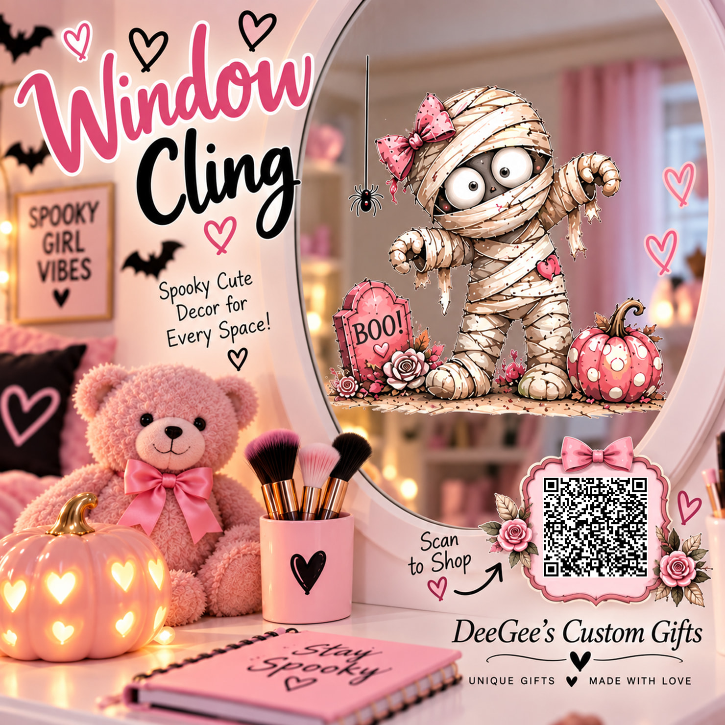
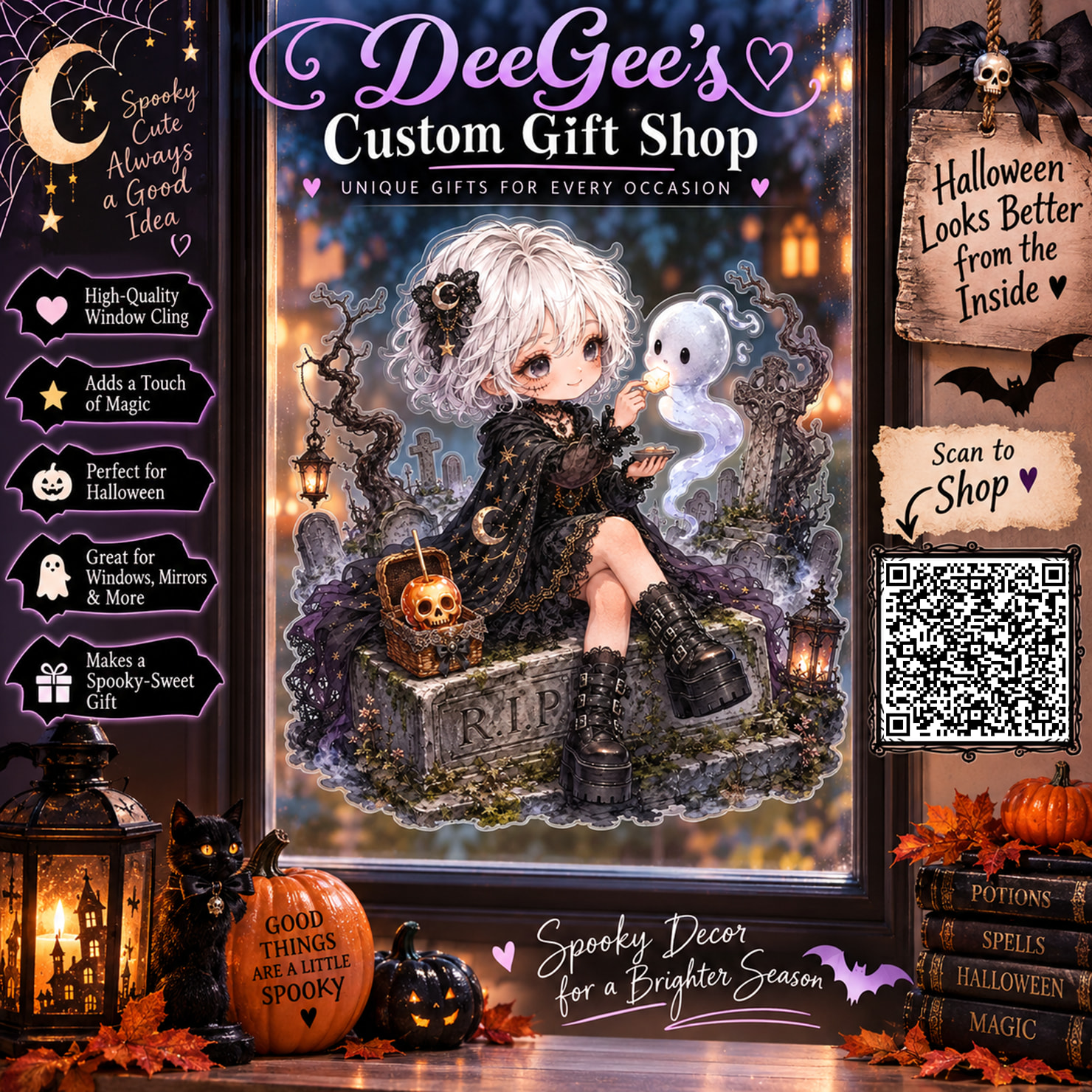
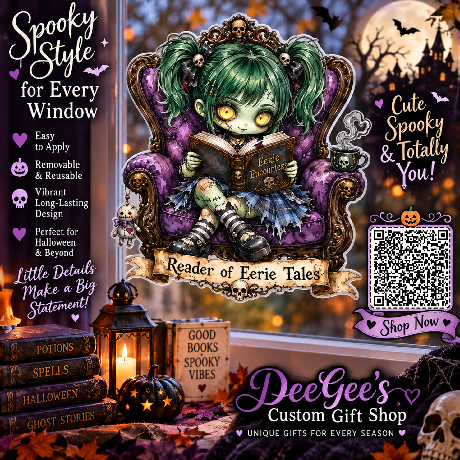
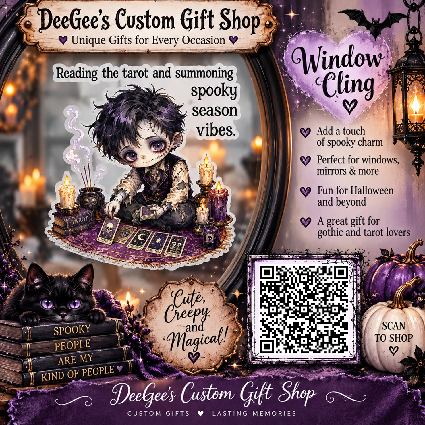
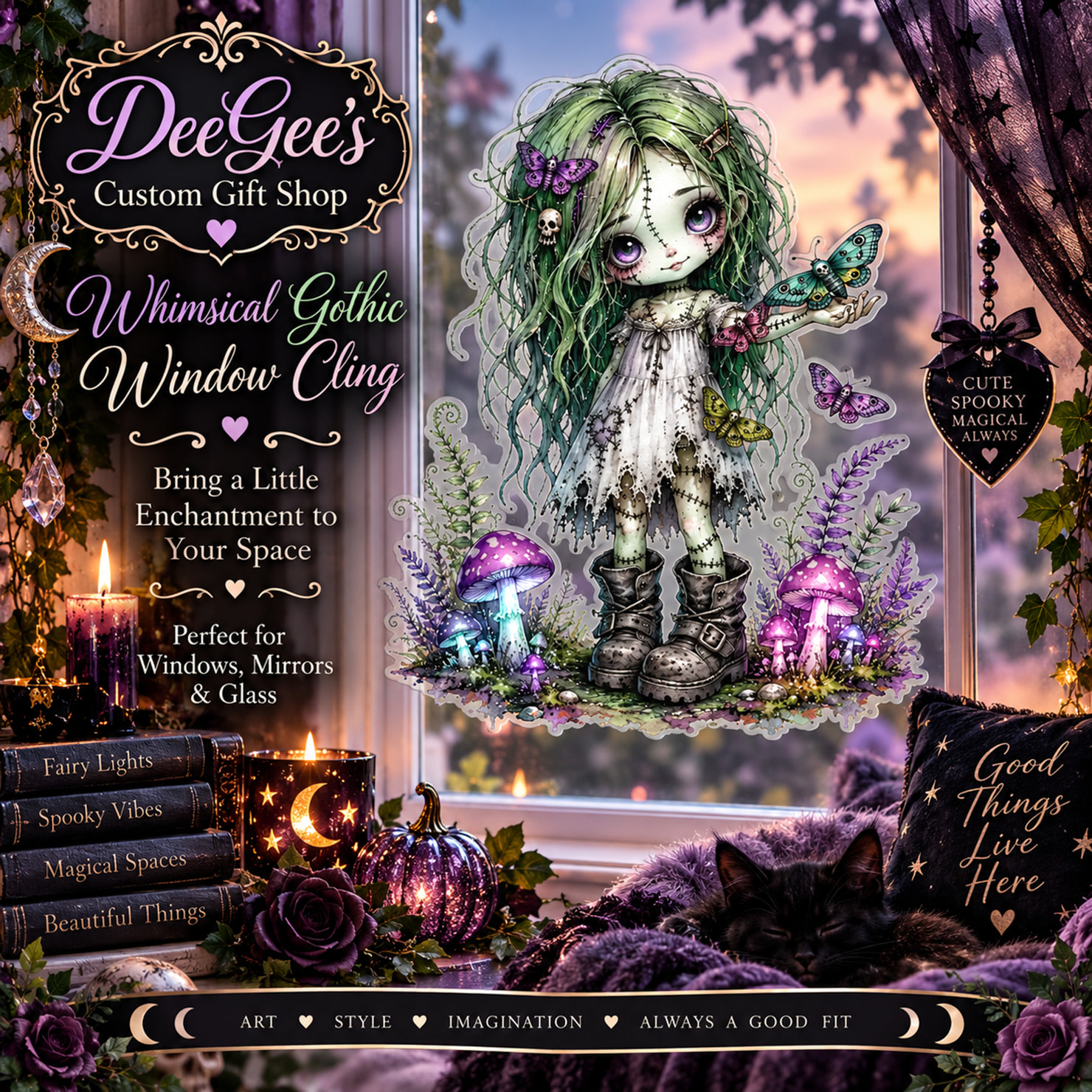
First, there is so much text on almost all of your images. I’m only 48, but without my reading glasses, I simply can’t decipher any of it on my screen. And about the QR code: I browse on my PC, so what actually happens if someone scans it? Does it lead directly to your shop or to this specific product? Is there a specific strategy behind putting a QR code directly onto the main product image?
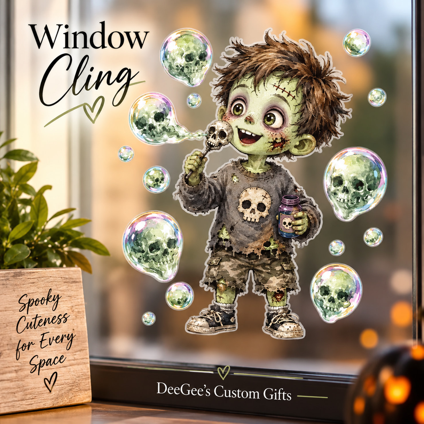
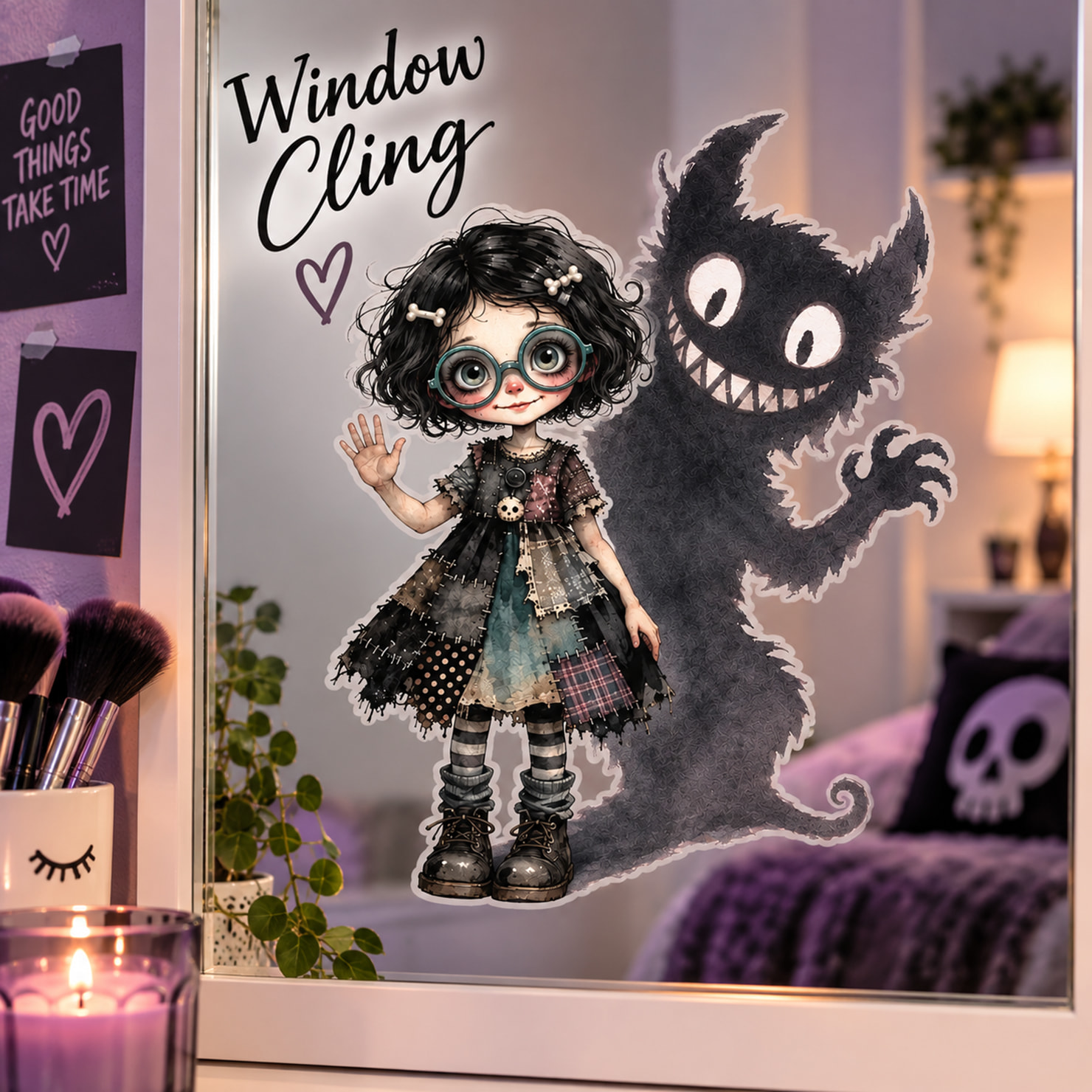
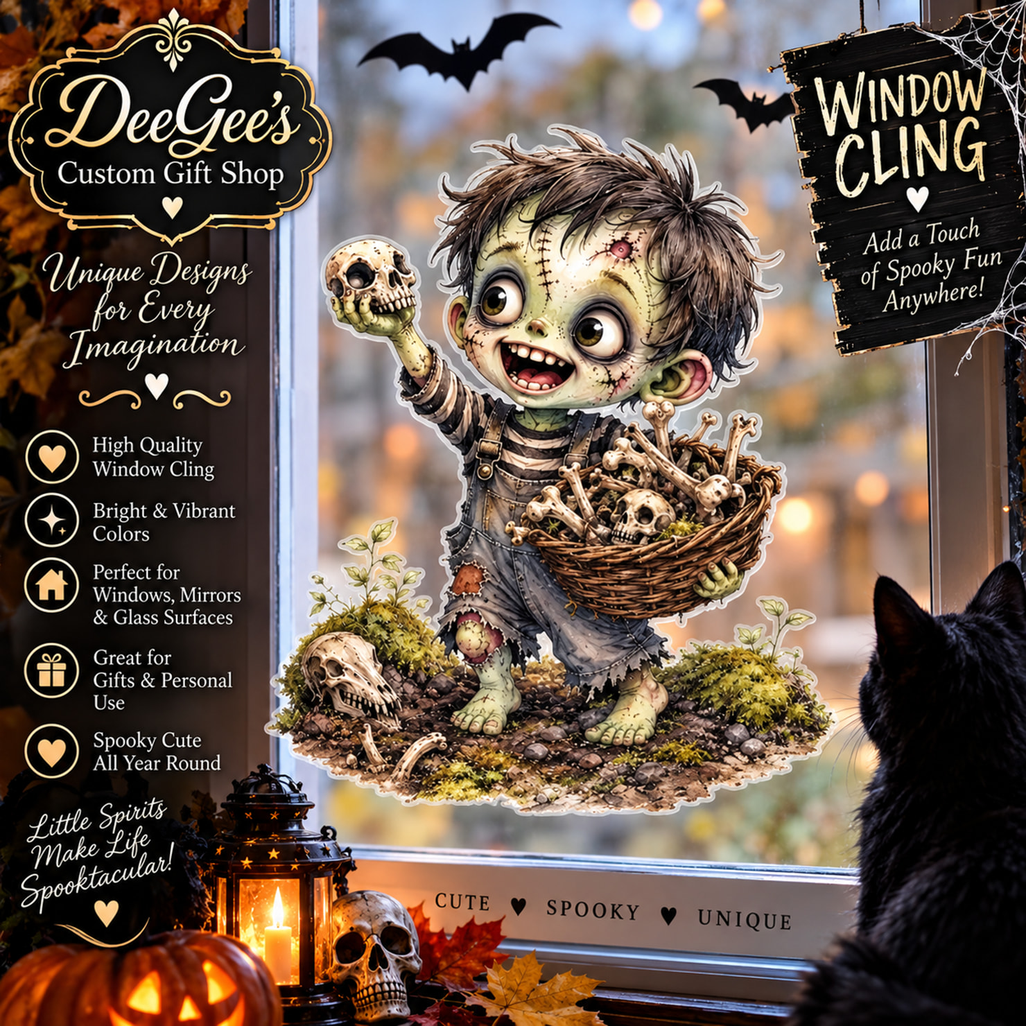
Your mockups in particular really make me wonder. Looking at this one, I honestly couldn’t tell what product you were actually offering. Are you selling lanterns, books, pumpkins, or the cat? I genuinely had to click on the listing just to figure out that it was a window cling!
Does this setup actually work for you in terms of sales? Sure, you got my click out of sheer confusion, but obviously, I didn’t buy—and I wonder if that’s an effective strategy in the long run.
I’d really love to hear your thoughts and the reasoning behind your layout choices!



Thank you so much for taking the time to give me such thoughtful and honest feedback!  I genuinely appreciate you asking rather than simply scrolling past, and I certainly don’t mind the questions.
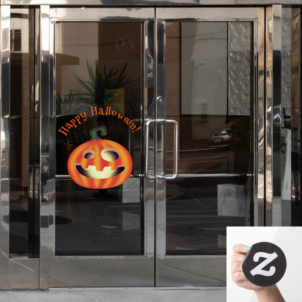
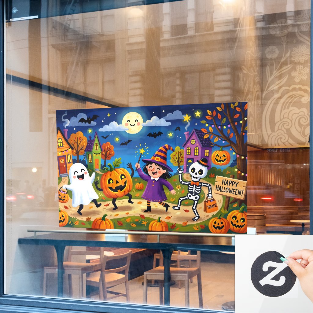
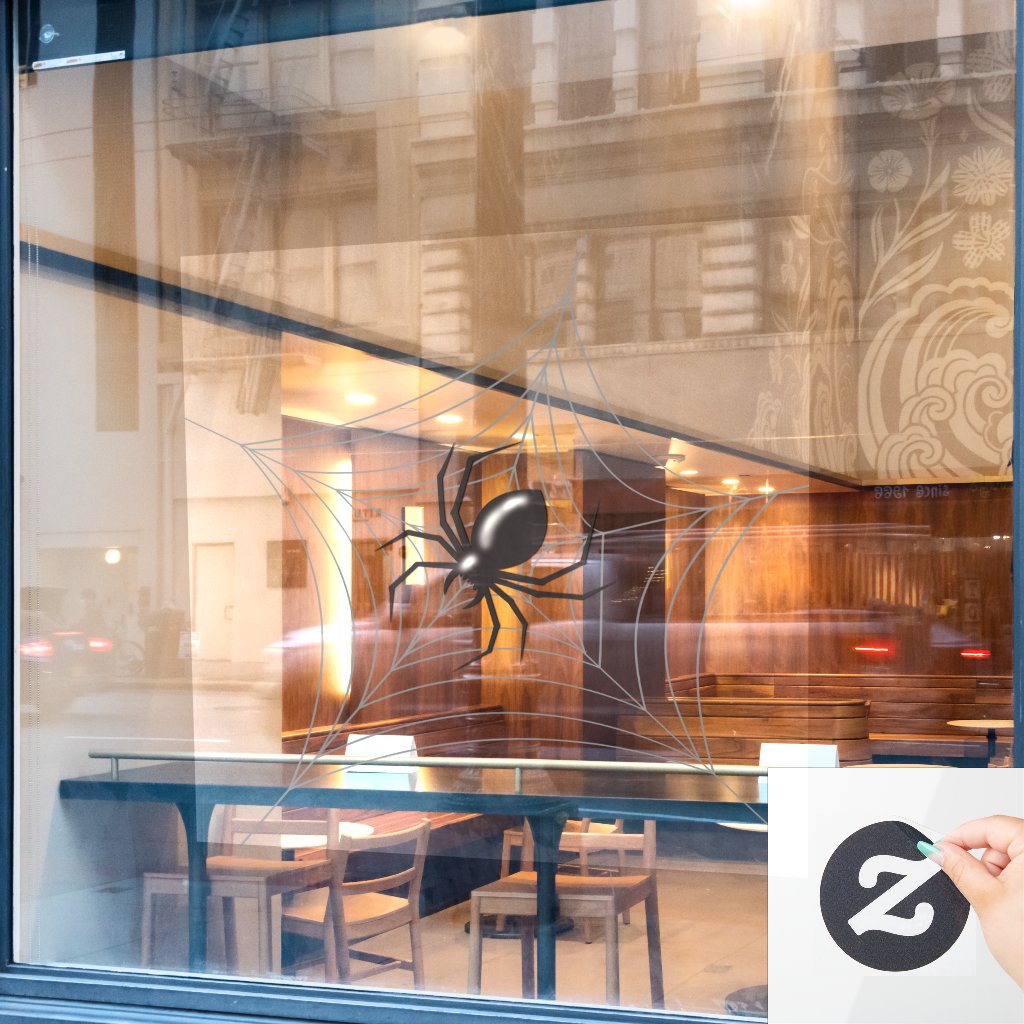
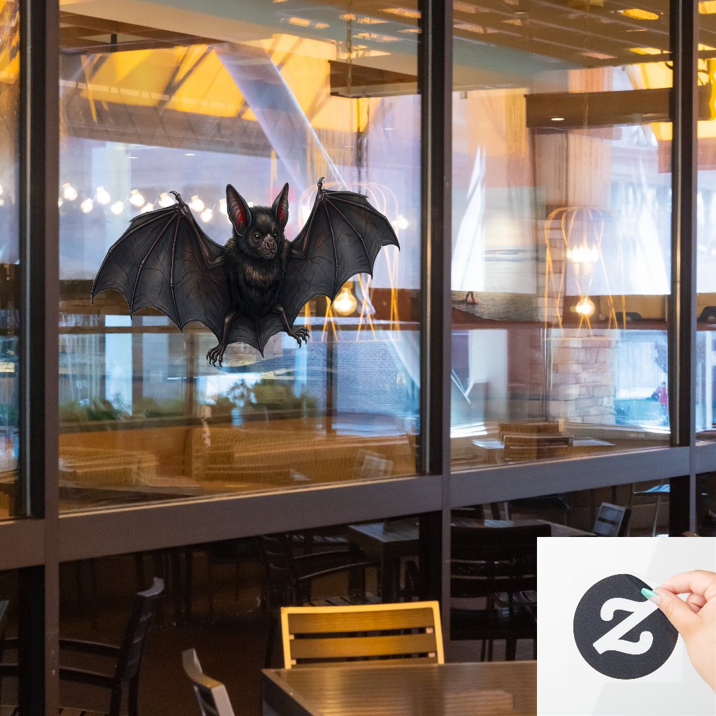
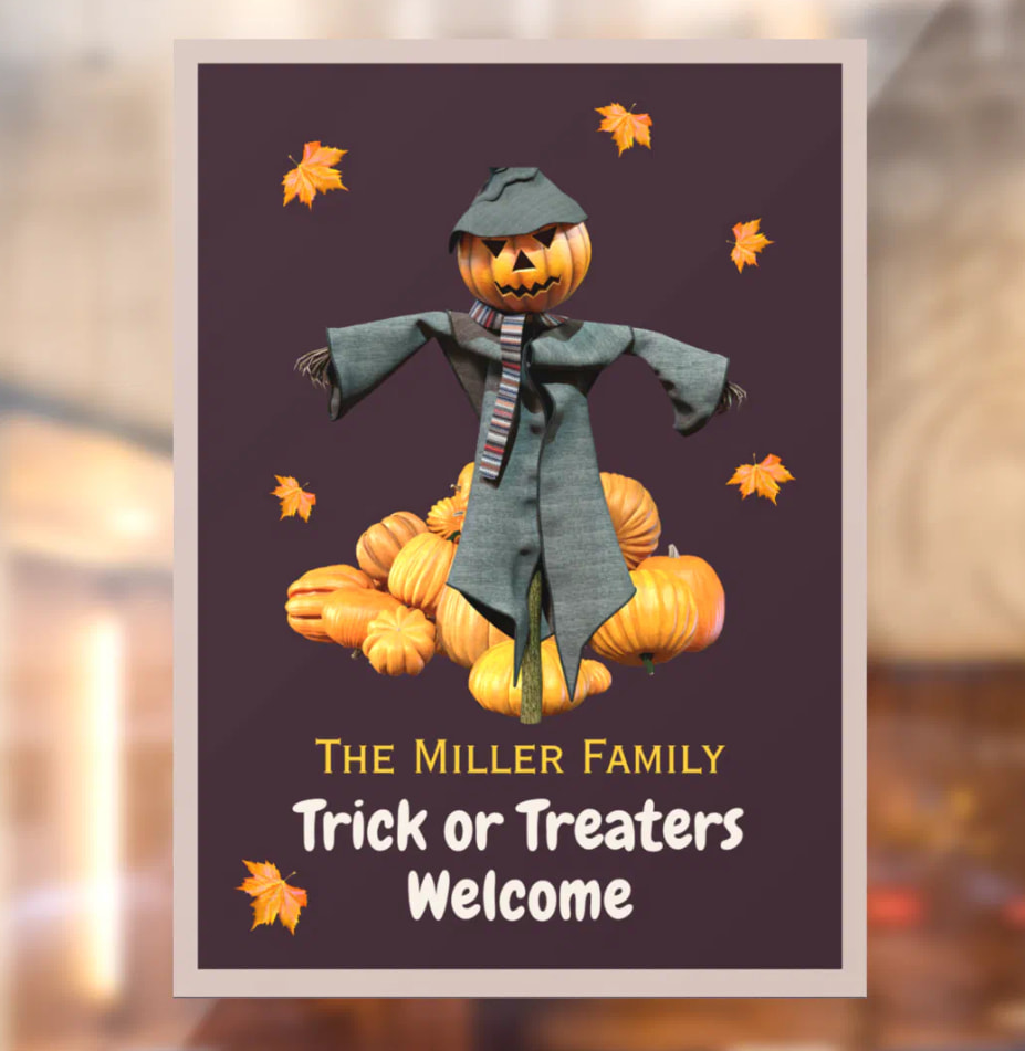
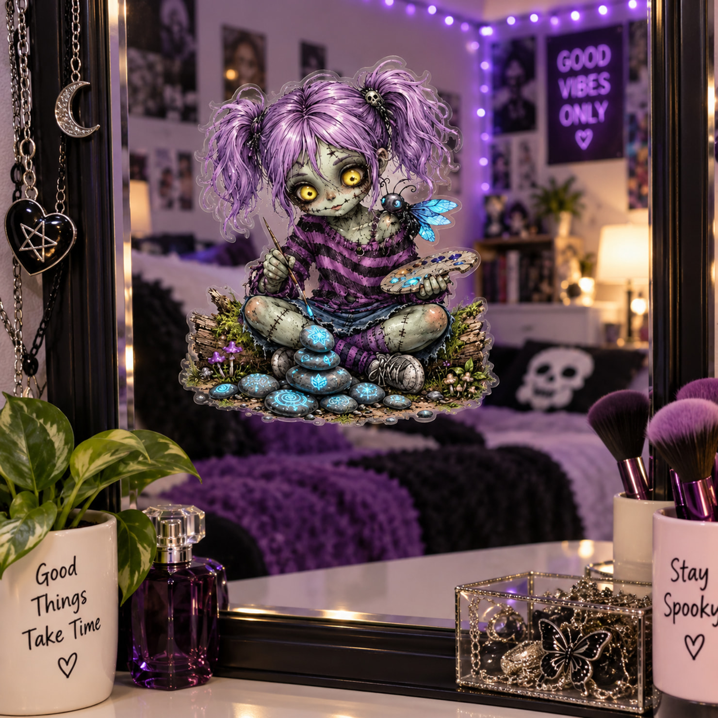
You actually gave me something to think about. My goal with the mockups is to create an attractive scene that shows people how the product might look in their home, while also making the promotional information easy to find. I can definitely see how, in some cases, I may have included too much text or too many surrounding elements, which could make it less obvious what the actual product is.
As for the QR codes, mine are intended to take people directly to the specific Zazzle product rather than simply to my shop. I realize they’re probably more useful for people viewing my promotions on another device, such as a phone, rather than someone already browsing on a PC. I’ve been experimenting with them as part of my overall marketing strategy, but I’m always willing to rethink what works best.
And you’re absolutely right about the window cling example. If someone has to click the listing just to figure out what I’m actually selling, then I need to make that clearer in the image itself.  That’s valuable feedback.
I’m still experimenting and learning what gets attention and, more importantly, what turns that attention into sales. I don’t want someone clicking because they’re confused—I want them clicking because they immediately understand and like what they see!
So honestly, thank you. I appreciate the constructive criticism, and I’m going to take a closer look at simplifying some of my layouts and making the actual product much more obvious. I’m always happy to hear different perspectives, especially when they’re shared as respectfully as you did.