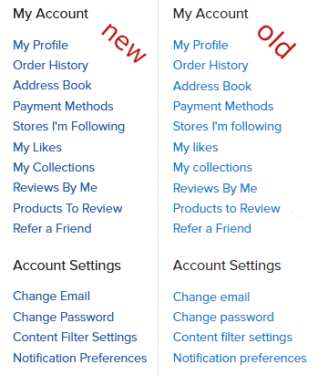
We just made a few updates that I wanted to share:
We darkened the shade of blue that we’re using as an accent color. This is to help with accessibility. This change also happened on Zazzle.com. As I’m typing up this post I see a spot that I missed, which I’ll take care of very soon.
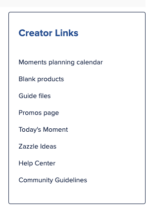
There’s now a “Creator Links” pod in the right sidebar of the Home Page and the Creator Hub. There’s links to some common things (blanks page) and links to not-so-common things (Today’s Moment page, Guide Files page). There’s also a link to Zazzle Ideas in case you need some creative inspiration, and a link to some Creator-specific articles in our Help Center.
We’ve got a very busy year lined up, and we hope to have the look and feel of this community site dialed in very soon. I will provide updates as they become available. If anyone has any comments or suggestions feel free to leave them below.
The guide files are very intriguing. It looks like currently only PDF is available but that AI, PNG and PSD could be included in the future but just haven’t yet. Is this true? Also, is there a plan to put in guide files for the other items which are listed but don’t have guide files? I hope so. That would be great.
Thank you for including all the other stuff too. The moments planning guide is a particularly good addition.
I am wondering what is meant by accessibility. I used to be able to tell when words in the forum were blue. Now I can’t tell the difference between the blue and the black letters.
Also, those links in the box dump me out of the forum rather than opening the link in a new tab. Therefore I probably won’t use them.
I haven’t forgotten about this. The functionality doesn’t seem to exist at this time. Our provider has an open ticket on the topic and when that’s resolved I’ll update the settings here. Unknown ETA.
I’ve tested the links in MacOS, Windows, iOS, PadOS, and Android and browsers all open the links as new tabs. Is it possible that you have a setting that’s keeping the link from being opened in a new tab?
There’s now a “Creator Links” pod in the right sidebar of the Home Page and the Creator Hub. There’s links to some common things (blanks page) and links to not-so-common things (Today’s Moment page, Guide Files page). There’s also a link to Zazzle Ideas in case you need some creative inspiration, and a link to some Creator-specific articles in our Help Center.
Call me stupid but are you calling a pop out window a “pod”? Would this new window be found under the hamburger icon? If so, where? Would it be available to everyone at this time or is it working it’s way through the system? I can’t find your example anywhere. I appreciate your work but this is getting harder to find things.
Lordy what an idiot I am. I didn’t realize you mean here in the Forum. From the wording I thought you meant on the Zazzle Home page. I didn’t realize you called side-bars “pods” now. lol
Thanks Scott
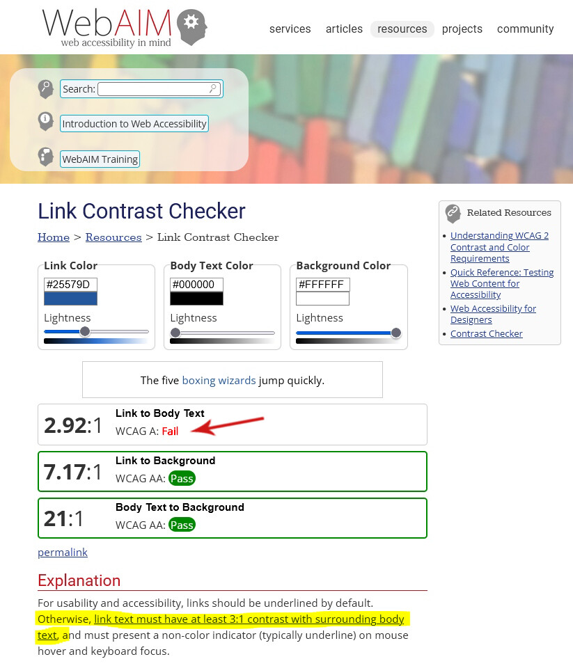
Excellent example. That web accessibility page you linked to has light blue links which are easily visible and which look like links. That would be something good to aim for.
I appreciate the efforts towards accessibility, but the new darker blue is much harder to differentiate from the black text than the old blue which offered more contrast .
Windy pointed to the Wikipedia article as a suggestion of the color we should use for links. “That would be something good to aim for,” he says. I do agree that the links are easily discernible.
The link color is #0645ad, and when I plug that value into the website you’ve linked in your post I see that it fails the WCAG test, and by an even larger margin than our current website does.
I’m no expert in web accessibility myself, but it seems like choosing a link color with sufficient color separation from the body text AND sufficient color separation from the background AND fits within brand guidelines AND is easy on the eyes may be quite difficult . I have a meeting scheduled with one of our designers in a few days and I’ll mention the comments above to see if there’s anything that we can do.
Is the “new” blue color for links also showing in the earnings reports? (I think yes) Today when I looked, I could barely tell the difference between the product title (Link) and the remainder of the chart information until hovering turned the title to ORANGE.

 I didn’t realize you mean here in the Forum. From the wording I thought you meant on the Zazzle Home page. I didn’t realize you called side-bars “pods” now. lol