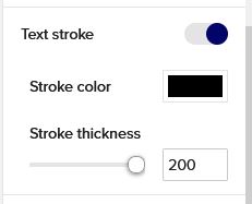
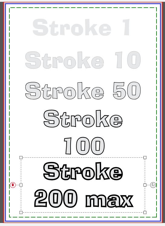
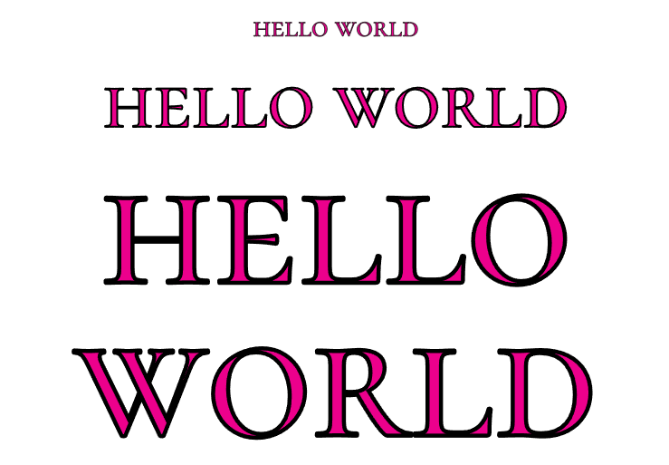
As you can see, the max stroke size is 200. Also, the stroke is aligned to the centre of the characters, so it is gonna look weirder on fonts that have a lot of variance in thickness.
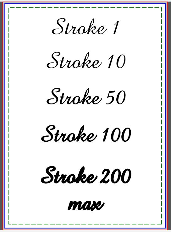
I think the most useful application of this new setting can be seen when applied, with same color, to a script font like Amazone:
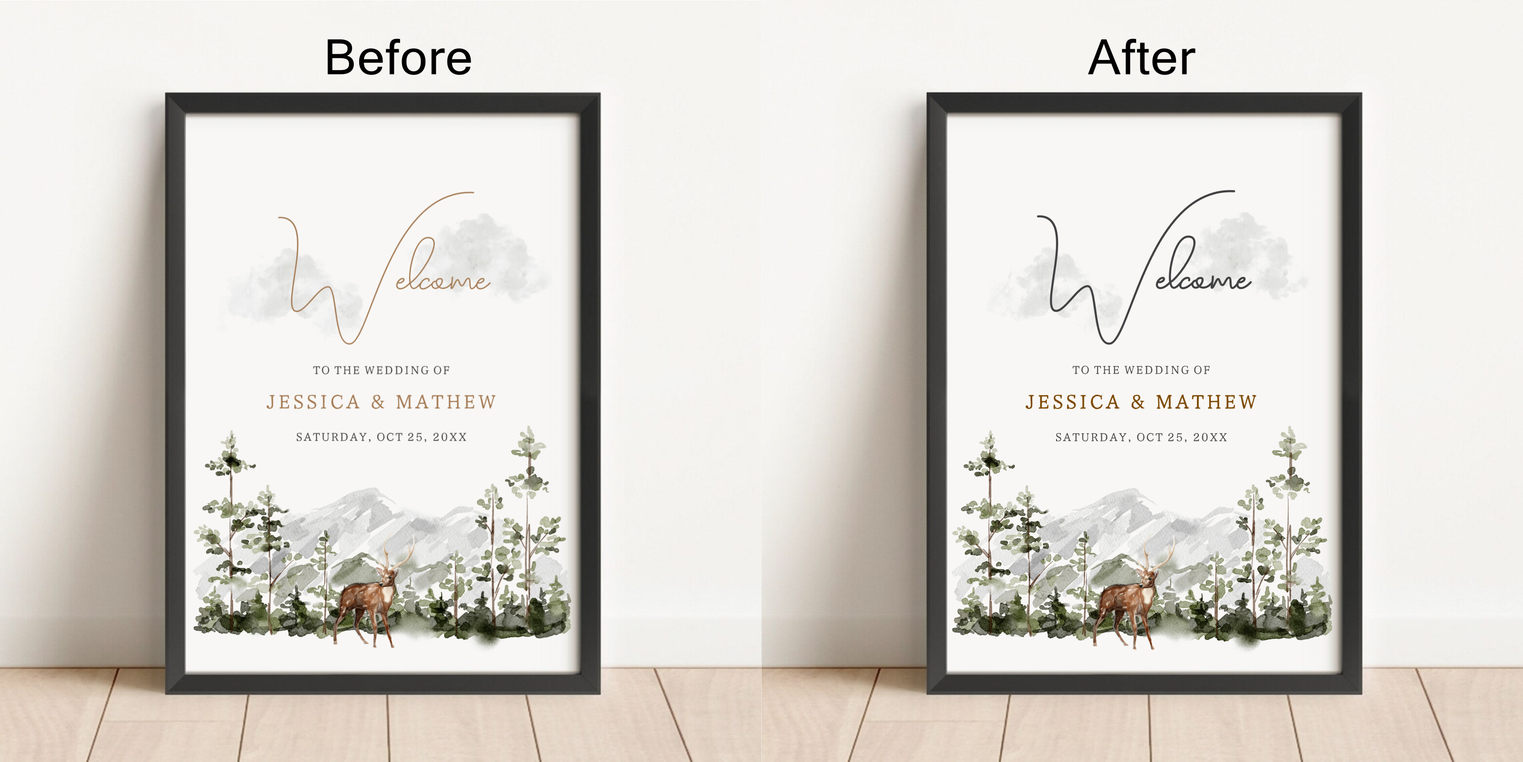
Fascinating! Another use case I can think of is increasing contrast between font and background. Sometimes I want to put a white/light colored font across an image (like a photo) that has mixed light and dark areas. A very thin dark stroke can improve visibility when the font crosses over a light portion of the image.
I just tried it on one of my favorite fonts that I never use because it’s way too thin (Poiret One), and suddenly, I’ll be able to use it. I also tried with contrasting strokes on variously colored backgrounds.
A heads up, I think it is still a little buggy right now. Off and on when I try it on fonts it will make the letters look “hairy”. Also, I am finding that the stroke stays toggled on even if I open a new template to work on so I get a stroke that I didn’t intend.
Over time and in my nearly obsessive collecting of fonts, I’ve found some that are poorly constructed, which can be seen when set to large sizes. Of course, I don’t know if this causes “hairiness,” but if there are tiny lumps and bumps in the lines, they’ll certainly be exaggerated by strokes. Of course, this is mere speculation on my part.
Does anybody know exactly what the numbers mean? Like if you set the stroke to 25, is that 25 pixels/dots (as in DPI) or is it a percentage of something? It seems like it’s something relative to the size of the font because in this example the stroke is set to 75 for all of these but clearly the line is wider for the bigger font size.
It would be really nice if we somehow had the option to control which way the stroke was going to expand. Like if we could choose to make it expand outside the edge instead of encroaching in on the letter - or maybe I just don’t understand exactly what it’s doing.
I suspect the majority of customers would understand “outline” more readily than “stroke,” which seems to be more an image editor term than a general one. Checking font terminology, I found this: " Stroke refers to the lines and curves of the characters. Some typefaces have uniform stroke weight , meaning each part of the letter is the same width. Calligraphy styles have varied stroke weight, with some parts of the letters very thin and other parts much thicker." An outline font, on the other hand, is the sort that’s usually hollow, the defining part being the outline.
So it seems what we have here is neither fish, nor fowl, nor good red herring. LOL
Stroke width- The numbers on the stroke signify a range of thickness that the user can choose. There is no particular meaning or unit associated with it.
Stroke scaling- As you have noticed, the stroke scales proportionally as the font sizes change. This is an intentional feature we implemented to make it easier to use.
Controlling the stroke direction- Our product team is exploring this feature right now, thank you for sharing your feedback.
I’m glad your idea of choosing either “inside” or “outside” for the placement of the stroke is, according to James, being currently considered. When a font has varying thick/thin parts, the thinner parts easily become nothing but the applied stroke. It can be seen between the R and the L in your example “WORLD.” Of course, if the stroke were outside in this example, it might be truly strange looking.