Community Updates
- Mark as New
- Bookmark
- Subscribe
- Mute
- Subscribe to RSS Feed
- Permalink
- Report Inappropriate Content
02-24-2022 09:23 AM
Hi Creators,
I wanted to take a few minutes to mention some updates that we have coming your way. These updates will improve the look and feel of the website, and also provide valuable new additions that will enhance your experience here. We don’t have an exact time set for these changes to be made, unfortunately, because some of these features are still being worked on. It’s likely that we’ll need to wait until all of this work is complete before these changes can go live. I’ll try to provide updates when they become available. As we continue to improve and evolve the community platform we welcome your feedback as to what features you are (and are not) using so that we can build the best site possible.
Basic structuring: We’re really excited to provide two different landing pages: the Home page and the Creators hub. With two options we hope that everyone will be able to find the right page to save as a bookmark.
- The Home Page is how most users enter the community, so this will be a page that’s designed to showcase notable pieces of information and news, and to provide access to other content via search. Most users that visit a community only do so when there’s a need – if they encounter a bug, or have a question about how to accomplish a task, or similar. We’ve designed the home page with all of this in mind, so expect to find a search bar front and center, and some featured articles just below that. In due time we will be adding more content to the community, and plan to use the right sidebar to link to notable and important content, and provide additional tools for convenience.
- With the home page being focused on our user base at large, we’re tailoring the Creator hub to suit our frequent users. This page will eschew the flashiness of the home page in favor of a layout that’s brings the important stuff up front. Look for the page to contain a listing of the latest news articles up top with a full listing of the discussion forums below it. We’ll also be adding search capability to this page to aid in navigation.
The Community Help & Feedback section: This section already exists, but I wanted to take a minute to give it a mention here. With the community being a very different looking place these days, we’ve added a Community Help & Feedback section to the top menu bar so everyone can ask questions, leave feedback, and test the new tools out. We’d prefer to keep community-specific items here so the Creator section can be used for Zazzle-related content, but we understand that everyone is learning so no big deal. A quick explainer of the ways you can use the Community Help & Feedback section:
- Leave feedback or suggestions for the new community
- Ask for help on how to accomplish something, such as adding a signature to your posts
- Learning how to make use of the new text composition tools.
A few things we’re experimenting with:
- Text and Labels: we’re happy to see that people are making use of labels, especially in the in the Show Me forum. Unfortunately, there’s several hundred unique labels already, and so we’ll need to figure out how to display them on the page. The massive adoption of Labels has meant that the Label sidebar grew far too tall, and I cut it shorter at first, then removed it completely. It will hopefully return once we can add pagination to keep the pod reasonably small.
- A new way to collect feedback: Our Feedback and Community Feedback boards are slightly different than the rest. This new format makes it much easier to collect and submit feedback to our Product team, which is a big win for everyone. As we continue to grow as a company it becomes increasingly important that we find new ways to collect and review your feedback submitted so that we can continue to evolve and improve our products. The downside of this new format is that the comments are simplified: they do not allow users to give kudos to other comments, and users cannot reply directly to a comment. Generally, I would think of it like this:
- Feedback is for when you have an idea to send over to us. An example of this would be that you’d like to have an ability to move products from one store to another.
- General Discussion is for when you’d like to have a conversation about something. This might include a discussion about the Moments planning guide news article that we recently posted.
We have a few projects that are currently under way:
- Pro forums: we certainly have not forgotten about these! We definitely understand that they’re missed, and they’ll be returning as soon as possible. There’s a tiny bit of a delay getting these up and running because we’ve decided to tie them in with our login system. The benefits to this are that users will be graduated automatically once they reach their respective milestones, but the drawback to this is that it creates a bit of additional work for our provider to help tie it all together. We’re hoping this work can be completed in the very near future, and that the Pro forums can launch very soon.
- Member profiles linked together: Our next site update will help tie your community member profile to your Zazzle member profile. Let’s say that you’re reading someone’s post and you want to know a bit more about who they are. You can go to their member profile, then click on the “Find me on Zazzle” link, and then you’ll be taken to their Zazzle profile page. This feature is meant to provide a bit more context to who you’re interacting with our the community. This feature is coming soon. Of course, we won’t mind if you want to add a link to your Zazzle store in your signature. That’s all up to you.
- Updated navigation strip: The top navigational strip currently displays a few sections: Creators, News and Information, and Community Help and Feedback. This strip will soon be updated to include these items: Community Home, Creators, News and Information, Community Help and Feedback, FAQ, and Help. Below are explanations for the new sections:
- Community Home: this section will simply link back to our Community home page, and the Zazzle logo at the top of the page will then link to our main website.
- FAQ: This section will link to a page that contains answers to frequently asked questions for our Community site. We hope that including this information here will allow new users to get up to speed a bit quicker.
- Help: This will link over to our help center.
We are looking forward to updating the site with the improvements mentioned above. We may continue to adjust some details here and there as more content is added to the site.
- Mark as New
- Bookmark
- Subscribe
- Mute
- Subscribe to RSS Feed
- Permalink
- Report Inappropriate Content
02-25-2022 04:44 AM
Thank you for the update.👍
It's great to receive communication on what is in the works. 💐
- Mark as New
- Bookmark
- Subscribe
- Mute
- Subscribe to RSS Feed
- Permalink
- Report Inappropriate Content
02-25-2022 08:34 AM
Thanks for the update! Maybe a Top 25 labels drop down would help to keep some continuity?
Looking forward to seeing the ability to link member profiles.
- Mark as New
- Bookmark
- Subscribe
- Mute
- Subscribe to RSS Feed
- Permalink
- Report Inappropriate Content
03-03-2022 04:23 PM
Deploy is likely to happen tomorrow, Friday, March 4th.
- Mark as New
- Bookmark
- Subscribe
- Mute
- Subscribe to RSS Feed
- Permalink
- Report Inappropriate Content
03-03-2022 11:29 PM
- Mark as New
- Bookmark
- Subscribe
- Mute
- Subscribe to RSS Feed
- Permalink
- Report Inappropriate Content
03-04-2022 09:14 AM
And it looks like the changes are live!
- Mark as New
- Bookmark
- Subscribe
- Mute
- Subscribe to RSS Feed
- Permalink
- Report Inappropriate Content
03-05-2022 09:44 AM
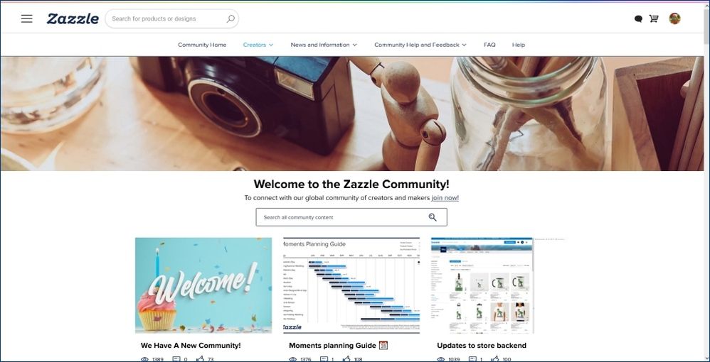
I like the much-improved nav bar along the top, the search box on every page, and the addition of some useful side-panels. I see there is an option to mark an entire section as Read at once instead of forum by forum. All very nice. 🙂 I'm wondering about the giant banner on the Home page though. I'm sure that particular image is just a placeholder, but why do we need one so big there? On my laptop it takes up about 1/4 of the screen:

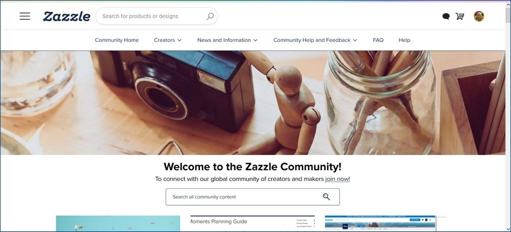
On my secondary monitor (tv screen) it takes up close to half the screen:

It just seems like a terrific waste of space. If it's there to add some color to an otherwise sterile page, you could use a solid color or non-busy pattern and move the "Welcome to the Zazzle Community" and the blurb below it and the search box all up over the image.
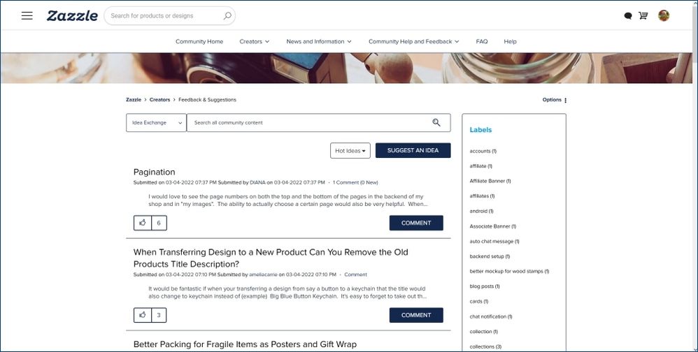
And then every other page shows roughly the top third of the banner:
Here again, if it's just there to add a little visual interest to the pages, if it was a solid color or non-busy pattern, it could be moved up behind the nav bar.
Also - here's another thread that was started for feedback on the changes:
feedback-suggestions/feedback-on-the-improved-community-forum-menu/
- Mark as New
- Bookmark
- Subscribe
- Mute
- Subscribe to RSS Feed
- Permalink
- Report Inappropriate Content
03-07-2022 11:44 AM
The image you're referring to is called a Hero image. It's currently just a placeholder, and will be updated in the future.
The screenshots that you're attaching look quite short. Are you running a standard sized TV (1920x1080) or are you using some special ultrawide display? What is the screen resolution that you're running on the TV?
- Mark as New
- Bookmark
- Subscribe
- Mute
- Subscribe to RSS Feed
- Permalink
- Report Inappropriate Content
03-07-2022 12:36 PM
My secondary monitor is a 36" flat-screen Sony TV connected to my laptop via HDMI cable. According to https://bestfirms.com/what-is-my-screen-resolution/ its current res setting is 1536 x 864. But the viewport size is only 1474 x 662 according to the browser extension I use to show me actual viewing area minus browser toolbars. So short, yes.
My laptop is 1920 x 1080, viewport area is 1857 x 939.
- Mark as New
- Bookmark
- Subscribe
- Mute
- Subscribe to RSS Feed
- Permalink
- Report Inappropriate Content
03-07-2022 11:30 AM
I just wanted to update this discussion to include some information from another conversation:
With new new search bar that appears in each of the pages there's a new section on the left side with some strange text. This is done to help refine your search. The section may read something like "Idea exchange" or "This board" and you can change it by clicking on it...but don't click on the down arrow. For some reason the down arrow itself is not clickable, which I'll be updating in the future.
The dropdown menu contains a few different options which help you refine or target your search. They are:
"All community" - this allows you to search through everything that's been posted in the community.
"This category" - this will search through only the category that you're currently viewing. Some categories are Creators, News & Information, and Community Help & Feedback. This search option can be useful in a few cases, such as when you're looking for a news release. In the future there will be hundreds of news articles in the section, so if you click into the "News & Information" section, then change the dropdown to "This category" then you can search through ONLY the category. This will show ONLY the news releases in the search results, which will eliminate bug reports and feedback posts.
"This board" or "Idea exchange" - these are new terms. They're both the equivalent of "discussion forum" and equate to sections like Affiliate Requests, Technical Issues, and Feedback & Suggestions. Using this option in the dropdown menu will allow you to search through ONLY posts in the board/idea exchange that you're currently viewing. So you can go to Technical Issues, then change the dropdown item to "This board" (or "Idea exchange") and then see ONLY search results from the selected board.
"Knowledge base" - we aren't using this section at this time, but there's no easy way to remove this option from the list.
"Users" - this allows you to search for a user.

