What's your favorite color pair?
- Mark as New
- Bookmark
- Subscribe
- Mute
- Subscribe to RSS Feed
- Permalink
- Report Inappropriate Content
12-08-2023 12:58 AM
What are some of the color pairs you really like?
Here are a few of mine I used this year:
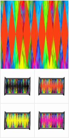
bold orange

tropical

romantic orange

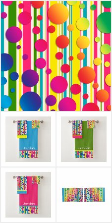
Alabaster

soft pink


barf green
Used a 600x250 pixel image divided by half and only solid colors if you want to continue in the same style,.
Which one do you like?
Remember that people's preference for colors is highly subjective and influenced by a variety of factors, such as mood, location and theme (birthday, wedding, etc.). Now let's show us your favorite pairs!
- Mark as New
- Bookmark
- Subscribe
- Mute
- Subscribe to RSS Feed
- Permalink
- Report Inappropriate Content
12-08-2023 06:30 AM
By the description "barf green" I'm going to guess that's not one of your preferences. 😆
- Mark as New
- Bookmark
- Subscribe
- Mute
- Subscribe to RSS Feed
- Permalink
- Report Inappropriate Content
12-08-2023 07:11 AM
Haha it looks ok, barf green is actually a regularly used color name for #94AC02 and variants.
- Mark as New
- Bookmark
- Subscribe
- Mute
- Subscribe to RSS Feed
- Permalink
- Report Inappropriate Content
12-08-2023 03:54 PM
I like the Alabaster and the Soft Pink.
I don't like color schemes with very saturated colors.
- Mark as New
- Bookmark
- Subscribe
- Mute
- Subscribe to RSS Feed
- Permalink
- Report Inappropriate Content
12-09-2023 11:06 PM
OK, so @Lais and everyone else who dislikes saturated color will be horrified, but this is my fav color "pair". I couldn't narrow it down to just two as for me they are a mix n match set that works in any two, three, or all four.

These are what I call my Fiesta colors as they come from dishes stuck behind cupboard doors:

That yellow/green wall was a long dark hallway leading to the living room. Painting it in fiesta colors made it a much brighter, happier space. Here's the kitchen opposite that cupboard wall:

Didn't use the kitchen for eating so that was the very beginning of having a dedicated studio space for my arts & crafts. Went on to use the same bold Fiesta color-block scheme in two more kitchens over the years.
You can see my fav "fiesta colors" reflected in these two Collections, with the addition of hot pink:
I live for, and usually design in, bold color, but have to admit, I really do like @Pixelan 's barf green pair.
- Mark as New
- Bookmark
- Subscribe
- Mute
- Subscribe to RSS Feed
- Permalink
- Report Inappropriate Content
12-10-2023 03:35 AM
Not my personal taste but I do love seeing it at other places, looks very cheerful and different than the current trend. Combined with white borders it looks great!
Reminds me of 80's tupperware colors. I can still remember how it feels when you open that lid.

Thanks for sharing!
- Mark as New
- Bookmark
- Subscribe
- Mute
- Subscribe to RSS Feed
- Permalink
- Report Inappropriate Content
12-10-2023 11:28 PM - edited 12-10-2023 11:39 PM
Ah, the Tupperware orange. That's taking me farther back to the Burnt Orange and Avocado Green of the 70's. 😵
Here's the kitchen end of that hallway:

If you think that's a lot, prepare yourself for the Before. Are you ready?
Here's how the hall was when we moved in:

Look familiar?

And if the little checks that made it feel like the wall was moving in and out weren't bad enough, it was topped with this:

And the horrors continued into the kitchen and living room with this:

Yeah. Stupefying.
Anyways, I hope more people post their fav color pairs swatches, I have a fun idea but need more Creators participating.
- Mark as New
- Bookmark
- Subscribe
- Mute
- Subscribe to RSS Feed
- Permalink
- Report Inappropriate Content
12-10-2023 05:28 AM
When we were stationed in Germany in the late 70's our rental apartment had that bubble stripe theme on the wall at the end of a long hallway. It was a talking point for years. Actually it still is when we start reminiscing. 😎
- Mark as New
- Bookmark
- Subscribe
- Mute
- Subscribe to RSS Feed
- Permalink
- Report Inappropriate Content
12-10-2023 10:23 AM
oh no! 😫 one or two saturated colors is okay, but all of them? 😳
- Mark as New
- Bookmark
- Subscribe
- Mute
- Subscribe to RSS Feed
- Permalink
- Report Inappropriate Content
12-10-2023 11:35 PM
Well heck, Microsoft did all four: 😉

😉
- Mark as New
- Bookmark
- Subscribe
- Mute
- Subscribe to RSS Feed
- Permalink
- Report Inappropriate Content
12-19-2023 01:28 PM - edited 12-19-2023 01:40 PM
Well, just to give a complete feedback:
- bold orange: hate it 😖
- tropical: nice, but should be called "watermelon" 🍉
- romantic orange: hate it 😖
- alabaster: love it! 😍
- soft pink: now that's romantic, love it 😍
- barf green: nice! 😊
And here are some color schemes I like:


I prefer a few unsaturated colors with one or two more saturated colors.
