Text Size on Oval Ornament?
- Mark as New
- Bookmark
- Subscribe
- Mute
- Subscribe to RSS Feed
- Permalink
- Report Inappropriate Content
09-13-2022 02:34 PM
I'm working on taking a design that has sold on 5x7 cards and re-creating it on other Christmas-related products, starting with this oval ornament. The back side is a rather long passage of text (a bible verse). The issue is that the longest line happens to be the very last line which falls into the narrower bottom part of the oval. In order to keep that line inside the safe-lines, the max font size I can use is 8.5.

There's no good spot for breaking this line into two shorter ones, and even if I did, the second half of the split line would just be pushed farther down into the even narrower part of the oval, requiring a smaller font size to fit.
So my question is - is 8.5 large enough here for the real-life actual-size end product? I just checked some business cards (close in actual size to this ornament) I made & ordered and they had some text at 9.7 ('Charter' font) and it's perfectly readable on the actual product.
- Mark as New
- Bookmark
- Subscribe
- Mute
- Subscribe to RSS Feed
- Permalink
- Report Inappropriate Content
09-14-2022 01:08 AM
Looking at the dimensions of the Oval ornament on the product page, the width is only 2.37" (5cms ish) so the all that text will be very difficult to read at 8.5 I think (I could be wrong).
You could alter the line spacing slightly and make it less than 1 and try and make the text bigger - gonna be a challenge though.
- Mark as New
- Bookmark
- Subscribe
- Mute
- Subscribe to RSS Feed
- Permalink
- Report Inappropriate Content
09-14-2022 08:33 AM
I would adjust your monitor so you're viewing the ornament at 100% & see if you can easily read it. That's what I always do when I'm unsure of the readability of my type size. (8.5 would normally sound like it would be legible, but 8.5 in one face is a different size than 8.5 in another. Blooming Elegant Sans was an example – it really ran small.) In this case, I have a feeling that 8.5 will be way too small.
- Mark as New
- Bookmark
- Subscribe
- Mute
- Subscribe to RSS Feed
- Permalink
- Report Inappropriate Content
09-14-2022 05:21 PM
Taking the line spacing down to .75 let me increase the font size to 9.5. Saving the preview image and reducing screen size to show it at approximate real-life size, it's still very small but readable. And since it's known text (a bible verse people buying it would already be familiar with) I think it's one of those things one can read sort of automatically from context and/or memory anyway; your brain knows what the word is even if your eyes can't quite make it out. If it were random text I wouldn't go with it at this size. And since it's the back of an ornament, not a greeting card or wall plaque or like, noone is really going to be reading it anyway, I think in this case it's the thought that counts so to speak. So I am going to give it a go with the reduced line spacing and slightly increased font size.
Thanks for your input!
- Mark as New
- Bookmark
- Subscribe
- Mute
- Subscribe to RSS Feed
- Permalink
- Report Inappropriate Content
09-14-2022 05:38 PM
Try using a shorter verse. Too many words won’t get read, even if they are legible.
- Mark as New
- Bookmark
- Subscribe
- Mute
- Subscribe to RSS Feed
- Permalink
- Report Inappropriate Content
09-14-2022 06:29 PM
I had considered that but I feel like the whole passage (which technically is five verses) is necessary in context to the image on the front. So for me it's all-or-nothing here; include the whole passage or put something else there entirely. I'm working on ideas for that but meanwhile I thought I'd throw it out here for feedback on the whole passage in the small font size.
- Mark as New
- Bookmark
- Subscribe
- Mute
- Subscribe to RSS Feed
- Permalink
- Report Inappropriate Content
09-14-2022 05:46 PM
I would not have replied with a suggestion, but I believe you have found your answer yourself ... it is the thought that truly counts and someone will treasure this if they have the fortune to receive it. Well done and best wishes.
- Mark as New
- Bookmark
- Subscribe
- Mute
- Subscribe to RSS Feed
- Permalink
- Report Inappropriate Content
09-14-2022 06:56 PM
Thank you so much!
This is the card design I am trying to re-work onto other Christmas products:
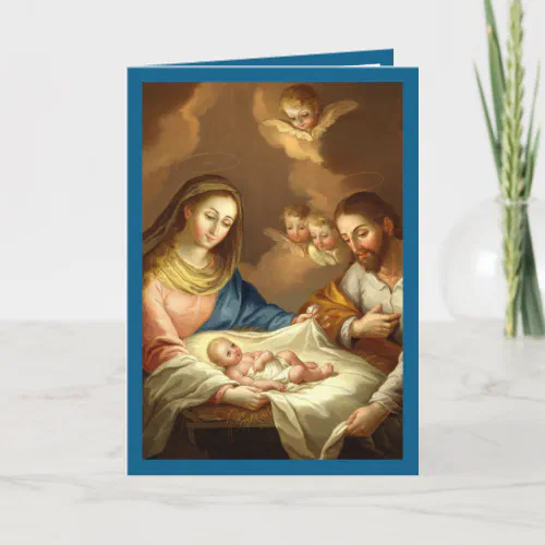
La Navidad Nativity Religious Spanish Christmas Holiday Card
by ThePasticheBoutique
"La Natividad" oil on canvas by José Campeche y Jordán ca. 1799.
