Cat
Esteemed Contributor
Options
- Subscribe to RSS Feed
- Mark as New
- Mark as Read
- Bookmark
- Subscribe
- Printer Friendly Page
- Report Inappropriate Content
02-08-2022
08:22 PM
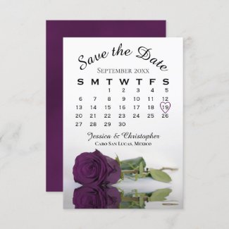
I kept thinking it was my eyes, but there seems to be a problem with the previews on the bottle labels. I'm hoping it's just a preview issue, not something about the printing process for these, but the colors just look WAY off. These cards use the exact same artwork as the bottle labels, but they don't even look close. Could this be fixed please? Thanks!
1 Comment


