I am trying to create home decor magazine layout style images
- Mark as New
- Bookmark
- Subscribe
- Mute
- Subscribe to RSS Feed
- Permalink
- Report Inappropriate Content
01-20-2025 08:27 PM - edited 01-20-2025 08:34 PM
How does this look?

<div style="text-align:center;line-height:150%">
<a href="https://www.zazzle.com/z/aazbnxrb?rf=238390644877301751" rel="nofollow"><img src="https://rlv.zcache.com/on_top_of_coneflower_poster-re9388fa344c641c987166018c0f38994_ilb2i_1024.jpg?..." alt="Glossy Poster" style="border:0;" /></a>
<br/>
<a href="https://www.zazzle.com/z/aazbnxrb?rf=238390644877301751" rel="nofollow">Glossy Poster</a>
<br/>by <a href="https://www.zazzle.com/store/marbethfourseasons?rf=238390644877301751" rel="nofollow">MarBethFourSeasons</a>
</div>
- Mark as New
- Bookmark
- Subscribe
- Mute
- Subscribe to RSS Feed
- Permalink
- Report Inappropriate Content
01-21-2025 04:42 AM
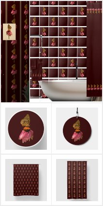
I'm going to share some information. I noticed some tile sales and guessed they were for backsplashes, we decided that maybe we will pursue a backsplash niche. The poster is our template for this bathroom . There is also the shower curtain bathroom in situ.
Anyhow, we used Zazzle's download feature to get the bathroom in situ and worked with it in Photo Editor and PicsArt. You can see that we have created an image of just the table, the tub, and the towel rack,. So we can put tiles in layers below the tub and towel rack and wall paper behind the table. We cropped the shower curtain, the towel set, and the pictures and placed them in the room. We cropped the brown tile and made a grid of tiles that is 10 x 10, because the tiles are 6" and most tubs are 60" long. Then we just clicked on the tile we wanted to change and hit change image. Now we can use it to create other bathroom images.
- Mark as New
- Bookmark
- Subscribe
- Mute
- Subscribe to RSS Feed
- Permalink
- Report Inappropriate Content
01-22-2025 05:40 AM
"How does this look?"
Honest opinion... it's way, way to busy and very dark. Keep your image simple by not adding so much into it. The tiles on the wall are appear to be huge and the white lines (grout?) look too uniformed. Their perspective with the tub is wrong.
My suggestion is use the internet for bathroom layouts to find inspiration. You will probably find that that deep color may not be on trend right now, however, you can get ideas for your product.
- Mark as New
- Bookmark
- Subscribe
- Mute
- Subscribe to RSS Feed
- Permalink
- Report Inappropriate Content
01-22-2025 07:49 AM
I am not sure I have understood what you are trying to do, apparently displaying different products with very similar designs on the same picture. Like @LMGildersleeve I think it looks too dark and too overloaded.
What I would do is :
- For the tiles, use them only on a subpart of a wall painted with a light solid color, it will highlight them and bring a touch of chic to the bathroom. ( you could do an horizontal frieze for example or just cover a short vertical area behind the bathtub faucet) . The tile joints seem much too wide to me, they should be reduced.
- Towels: I would place them just on a part of the wall painted with light solid color so they could be more visible.
- Curtains: If you place them on a part of the wall painted with light solid color they will also be more visible.
- Wallpaper. Can remain where it is, but only if there’s this painted part I evoked before on the bathroom side.
- Frames: They are quite invisible on this part of the wall, so what you can do is trying to stop the wallpaper at a height just a little bit higher than the sink and put a horizontal wooden stick above to lark the limit properly and on the top part, leave a painted wall to hang your frames and highlight them. I’m going to try to make a small mock-up to show you what I mean.
- Mark as New
- Bookmark
- Subscribe
- Mute
- Subscribe to RSS Feed
- Permalink
- Report Inappropriate Content
01-22-2025 08:35 AM
Here’s the idea ( very bad quality but it’s just to give you an illustration )

- Mark as New
- Bookmark
- Subscribe
- Mute
- Subscribe to RSS Feed
- Permalink
- Report Inappropriate Content
02-07-2025 11:06 PM
Here's where we're at now.
We're using 60" x 40" posters.
https://www.zazzle.com/black_and_white_striped_wallpaper_magazine_layout_poster-256992072308351695
https://www.pinterest.com/marilynscreativ/marbeth-home-arts-decor-icondoits-home-arts/
